04-ggplot2
Data Visualization with ggplot2 ❤️ 🐧
Q&A
Q: What is the difference between pull and select?
A:selectspecifies which columns to display in your resulting dataframe.pullextracts the values from a column and stores them in a vector (not a dataframe)
Q: I am a bit confused on factors and what levels mean.
A: Factors store categorical information. The levels of a factor are all the possible unique values in a variable.
Q: how similar is R to numpy/which scenarios are each used in the industry?
A: Basically, anything data science-y you can do in R, you can also do in python. R has linear algebra/working with matrices built directly into its base installation, so no additional package would be need for numpy-like operations. And,dplyrdoes very similar things topandas, but with a more readable and consistent syntax overall.
Q: would we ever load just dplyr instead of the entire tidyverse package? is there a big difference?
A: We’ll always just loadtidyverse. The difference is that thetidyverseis quite big, so if you ever wanted to just usedplyrfunctions, you could load just that. This matters more in development where you’re trying to minimize external dependencies and make code run as fast as possible. For our purposes, there’s no real need to only load dplyr
Q: I found the demos to be the most confusing part, because it’s very different understanding slides and applying that to actual coding. Personally, I would prefer if the lecture content were put into recordings, or just uploaded earlier so we could learn it on our own, and then have classes be more focused on data science best practices, applications, etc.
A: I do really like this idea and would love to run this like this in the. I’m curious what y’all think of this and will add a question like this to the post-course survey to get students’ thoughts.
Course Announcements
Due Dates:
- Lab 02 due Friday (11:59 PM)
- HW 01 due Monday (11:59 PM)
- Lecture Participation survey “due” after class
Suggested Reading
- R4DS Chapter 3: Data Visualization
- Data to Viz: https://www.data-to-viz.com/
ggplot2 \(\in\) tidyverse
- ggplot2 is tidyverse’s data visualization package
- Structure of the code for plots can be summarized as
ggplot(data = [dataset],
mapping = aes(x = [x-variable],
y = [y-variable])) +
geom_xxx() +
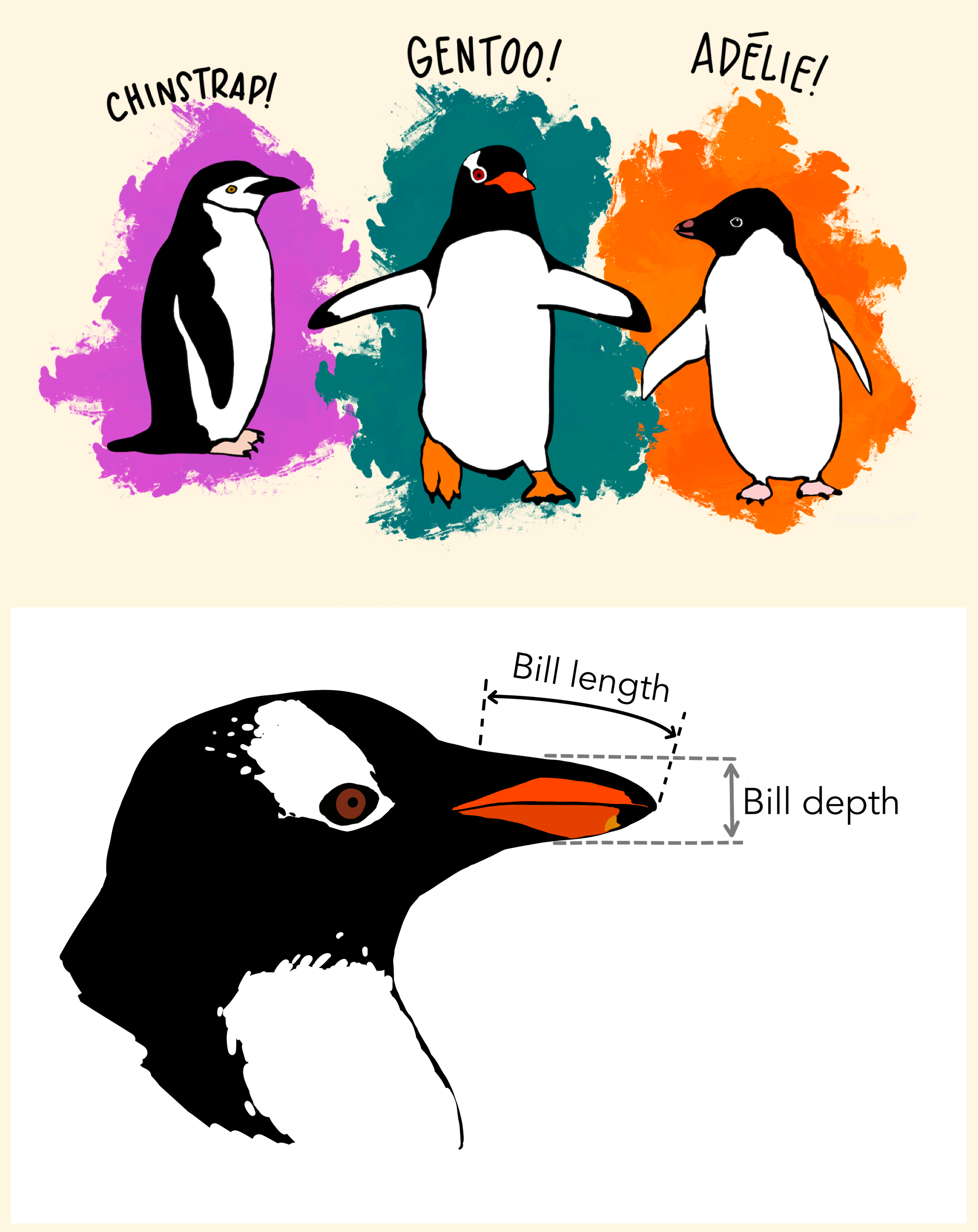
other optionsData: Palmer Penguins
Measurements for penguin species, island in Palmer Archipelago, size (flipper length, body mass, bill dimensions), and sex.
# install.packages("palmerpenguins")
library(palmerpenguins)
glimpse(penguins)
Rows: 344
Columns: 8
$ species <fct> Adelie, Adelie, Adelie, Adelie, Adelie, Adelie, Adel…
$ island <fct> Torgersen, Torgersen, Torgersen, Torgersen, Torgerse…
$ bill_length_mm <dbl> 39.1, 39.5, 40.3, NA, 36.7, 39.3, 38.9, 39.2, 34.1, …
$ bill_depth_mm <dbl> 18.7, 17.4, 18.0, NA, 19.3, 20.6, 17.8, 19.6, 18.1, …
$ flipper_length_mm <int> 181, 186, 195, NA, 193, 190, 181, 195, 193, 190, 186…
$ body_mass_g <int> 3750, 3800, 3250, NA, 3450, 3650, 3625, 4675, 3475, …
$ sex <fct> male, female, female, NA, female, male, female, male…
$ year <int> 2007, 2007, 2007, 2007, 2007, 2007, 2007, 2007, 2007…Artwork by @allison_horst
The Data
penguins |>
  datatable()
A Plot
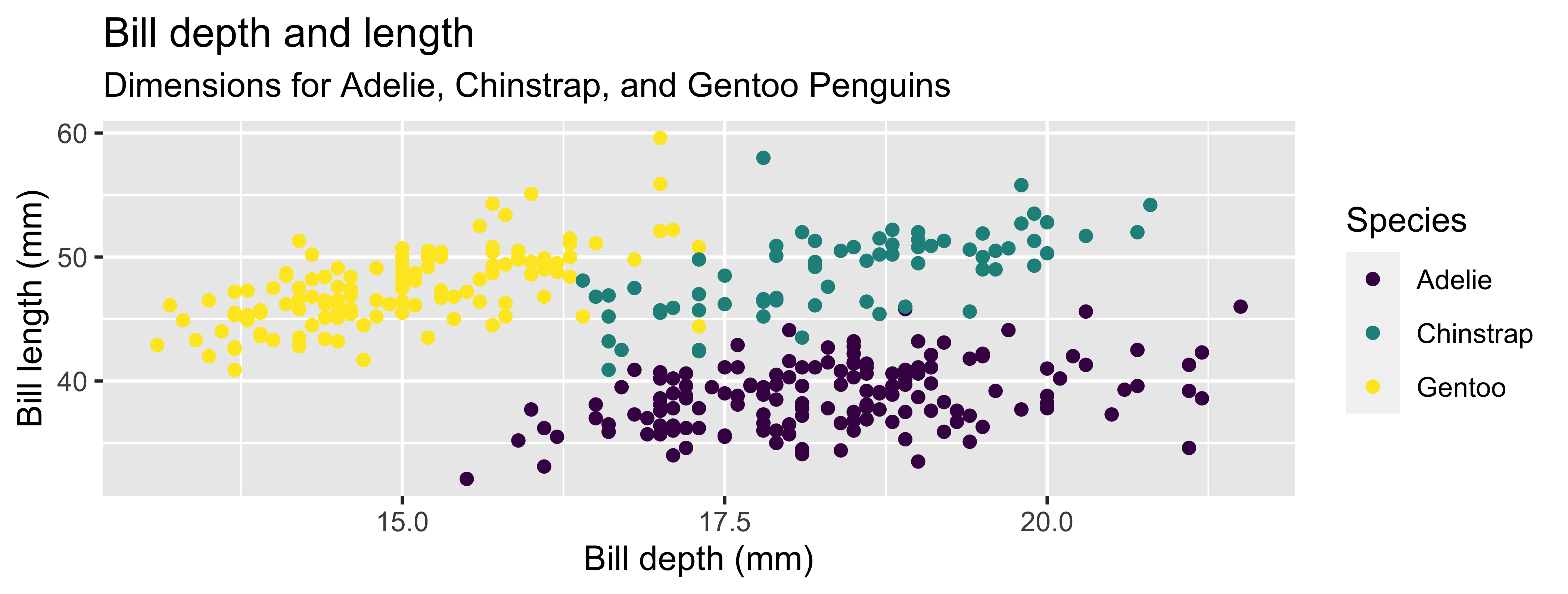
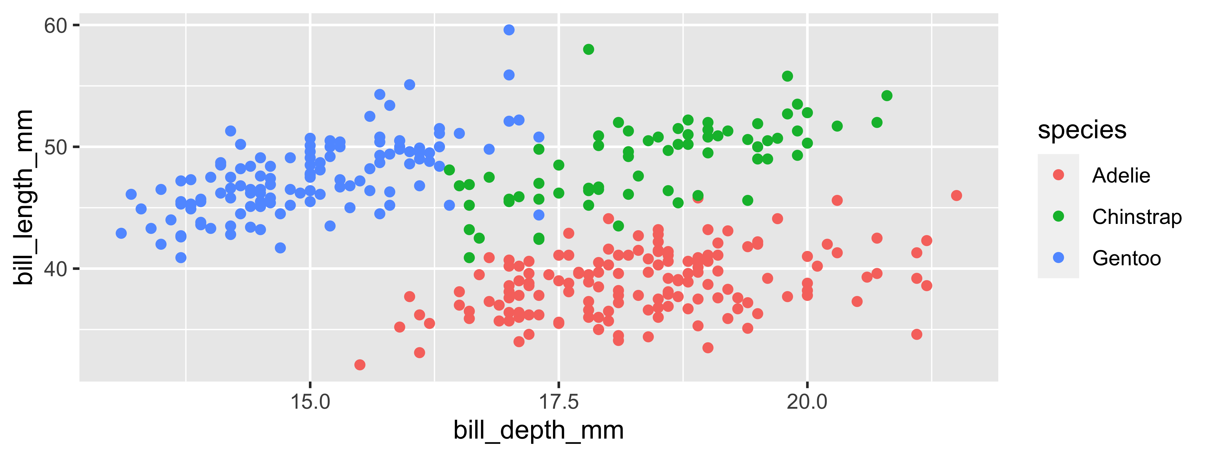
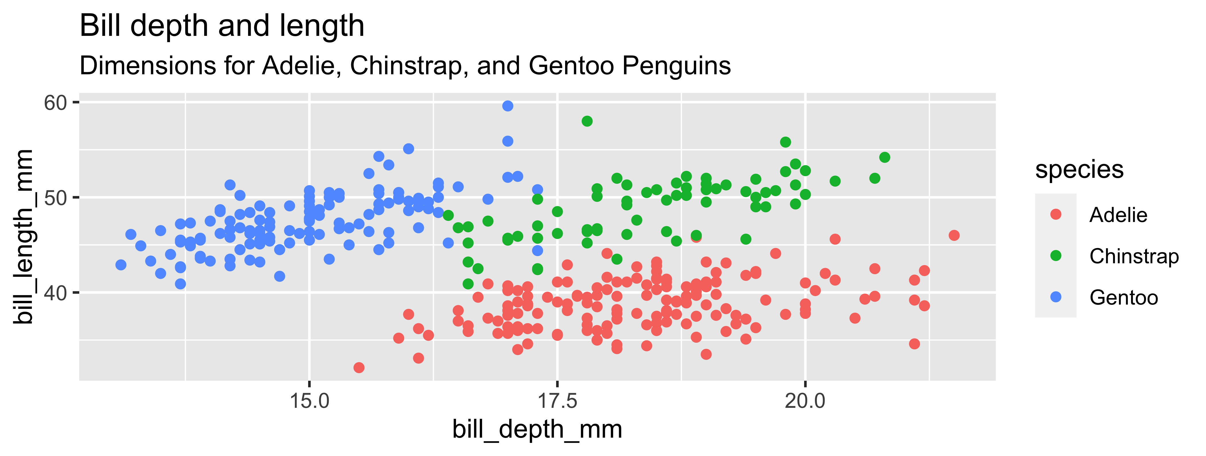
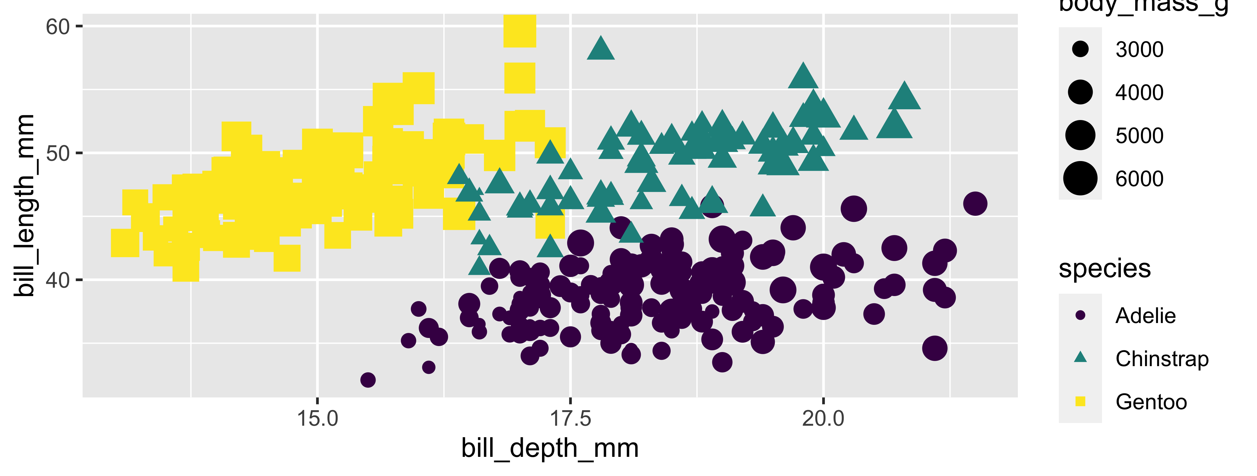
ggplot(data = penguins,
       mapping = aes(x = bill_depth_mm, y = bill_length_mm,
                     color = species)) +
  geom_point() +
  labs(title = "Bill depth and length",
       subtitle = "Dimensions for Adelie, Chinstrap, and Gentoo Penguins",
       x = "Bill depth (mm)", y = "Bill length (mm)",
       color = "Species") +
  scale_color_viridis_d()
Warning: Removed 2 rows containing missing values (`geom_point()`).Coding out loud
Start with the
penguinsdata frame
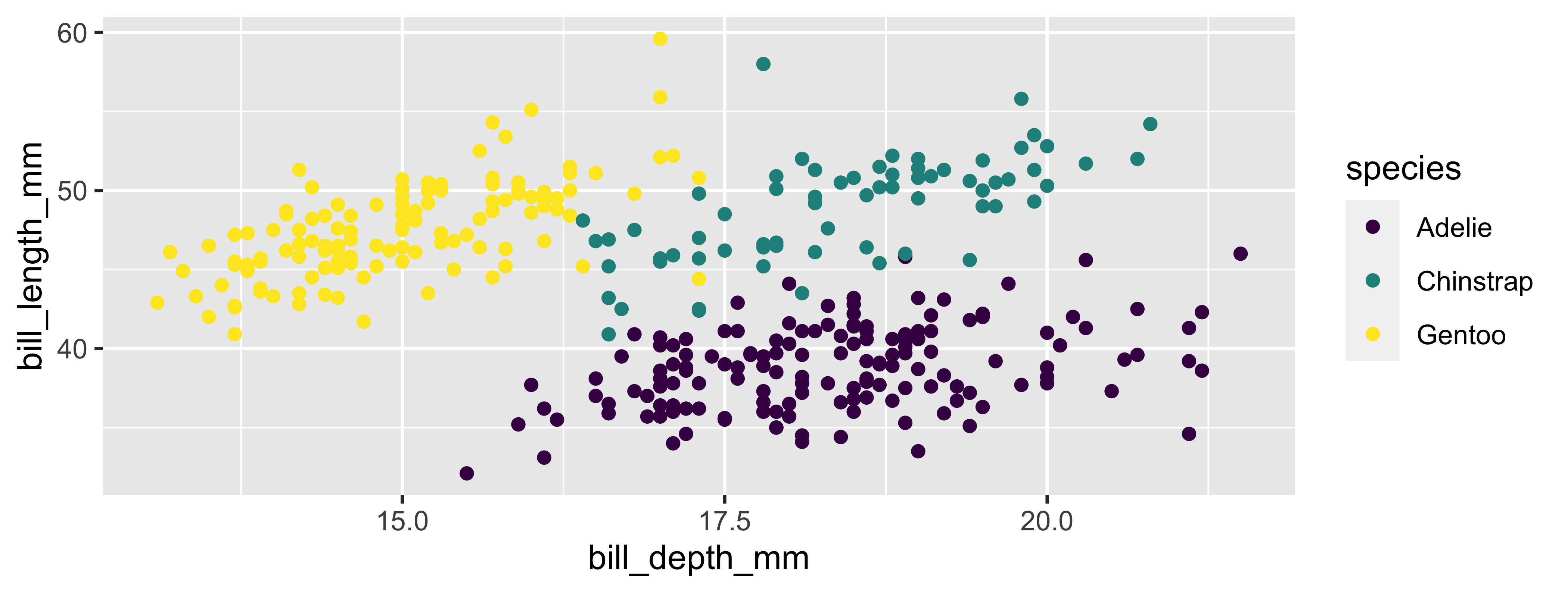
ggplot(data = penguins) 
Start with the
penguinsdata frame, map bill depth to the x-axis
ggplot(data = penguins,
       mapping = aes(x = bill_depth_mm))
Start with the
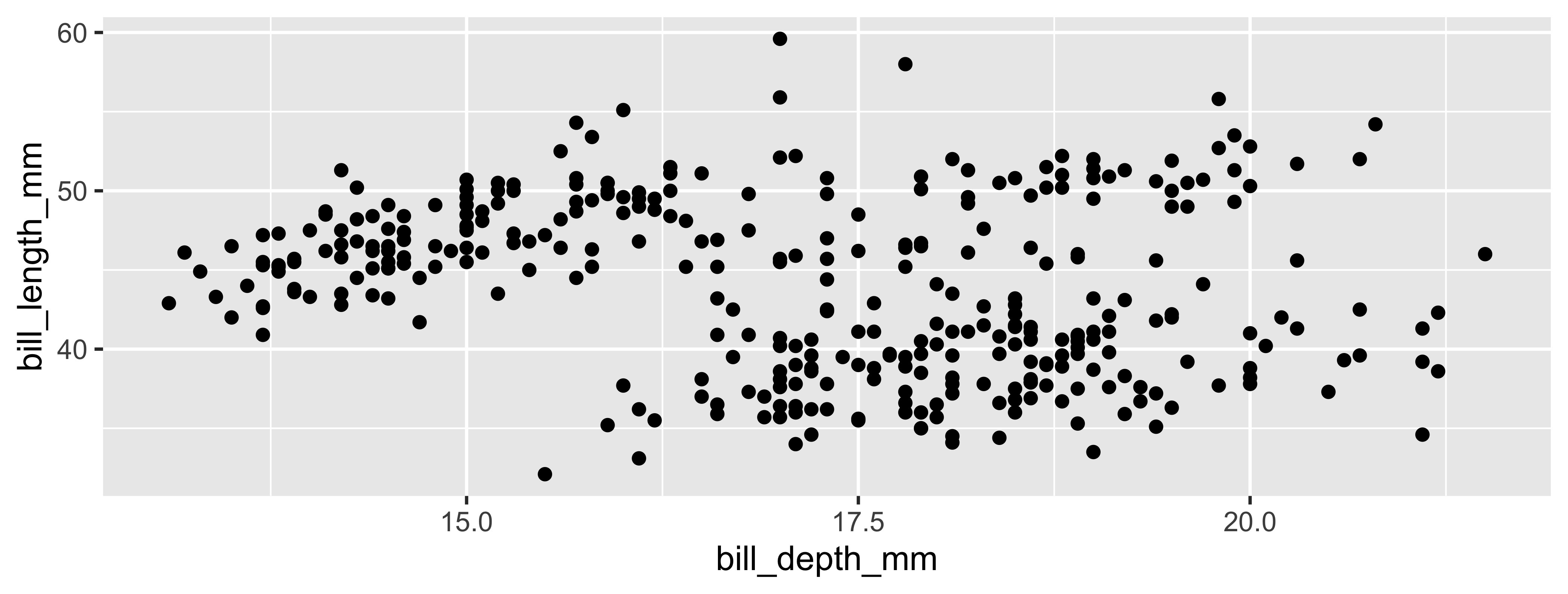
penguinsdata frame, map bill depth to the x-axis and map bill length to the y-axis.
Start with the
penguinsdata frame, map bill depth to the x-axis and map bill length to the y-axis. Represent each observation with a point
Start with the
penguinsdata frame, map bill depth to the x-axis and map bill length to the y-axis. Represent each observation with a point and map species to the color of each point.
Start with the
penguinsdata frame, map bill depth to the x-axis and map bill length to the y-axis. Represent each observation with a point and map species to the color of each point. Title the plot “Bill depth and length”
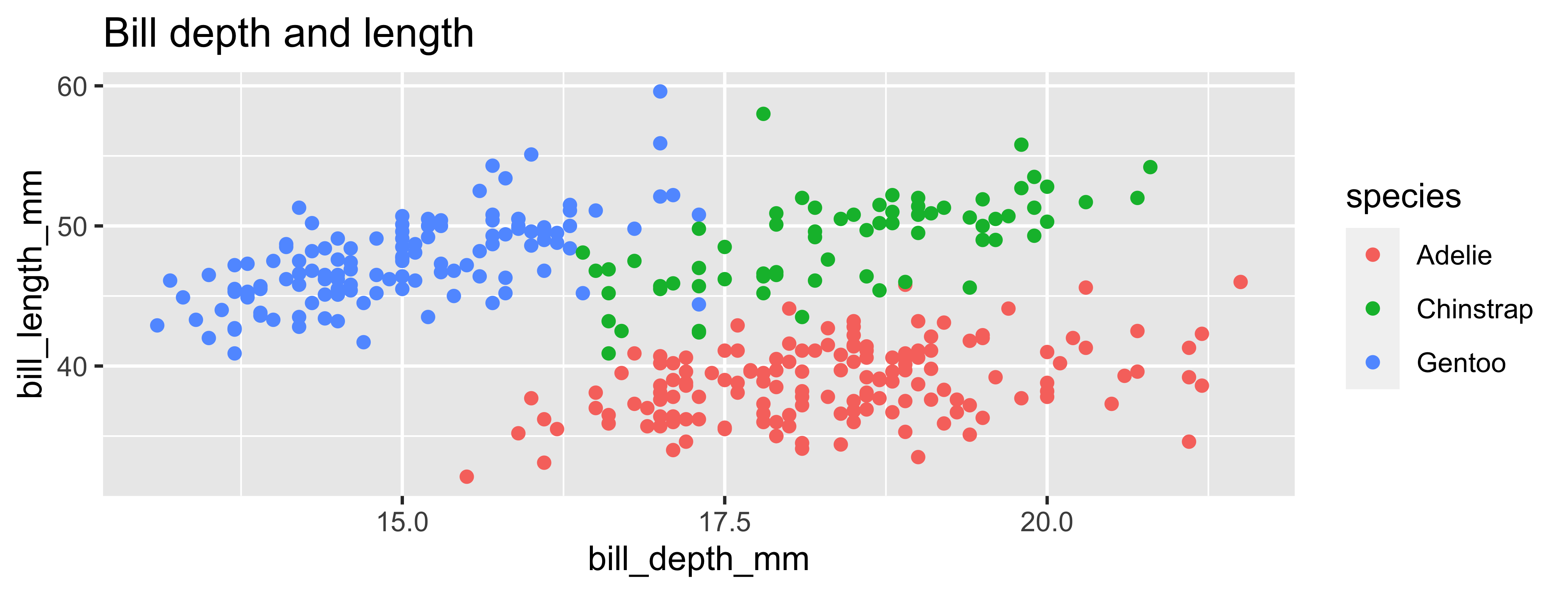
Start with the
penguinsdata frame, map bill depth to the x-axis and map bill length to the y-axis. Represent each observation with a point and map species to the color of each point. Title the plot “Bill depth and length”, add the subtitle “Dimensions for Adelie, Chinstrap, and Gentoo Penguins”
Start with the
penguinsdata frame, map bill depth to the x-axis and map bill length to the y-axis. Represent each observation with a point and map species to the color of each point. Title the plot “Bill depth and length”, add the subtitle “Dimensions for Adelie, Chinstrap, and Gentoo Penguins”, label the x and y axes as “Bill depth (mm)” and “Bill length (mm)”, respectively
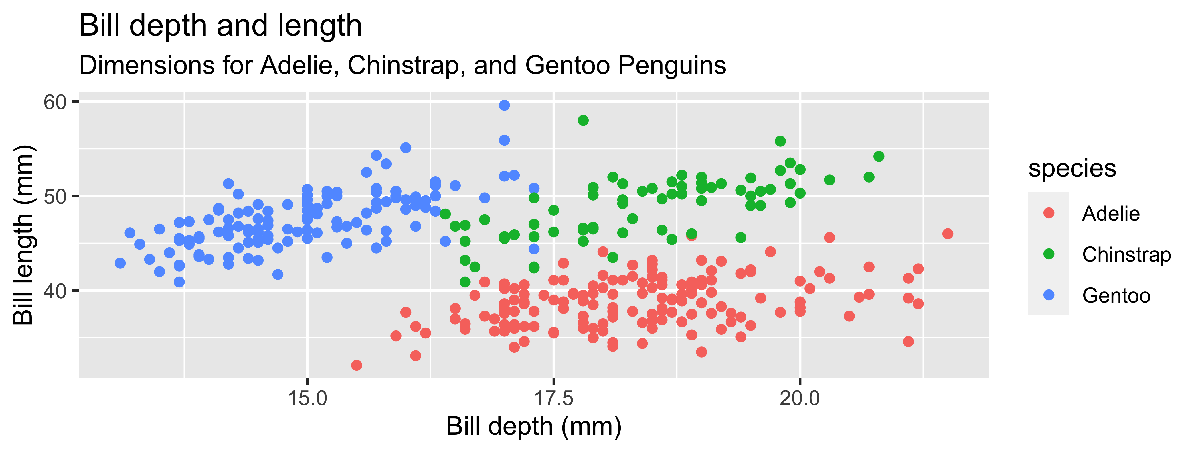
Start with the
penguinsdata frame, map bill depth to the x-axis and map bill length to the y-axis. Represent each observation with a point and map species to the color of each point. Title the plot “Bill depth and length”, add the subtitle “Dimensions for Adelie, Chinstrap, and Gentoo Penguins”, label the x and y axes as “Bill depth (mm)” and “Bill length (mm)”, respectively, label the legend “Species”

Start with the
penguinsdata frame, map bill depth to the x-axis and map bill length to the y-axis. Represent each observation with a point and map species to the color of each point. Title the plot “Bill depth and length”, add the subtitle “Dimensions for Adelie, Chinstrap, and Gentoo Penguins”, label the x and y axes as “Bill depth (mm)” and “Bill length (mm)”, respectively, label the legend “Species”, and add a caption for the data source.
ggplot(data = penguins,
       mapping = aes(x = bill_depth_mm,
                     y = bill_length_mm,
                     color = species)) +
geom_point() +
labs(title = "Bill depth and length",
subtitle = "Dimensions for Adelie, Chinstrap, and Gentoo Penguins",
x = "Bill depth (mm)", y = "Bill length (mm)",
color = "Species",
caption = "Source: Palmer Station LTER / palmerpenguins package") 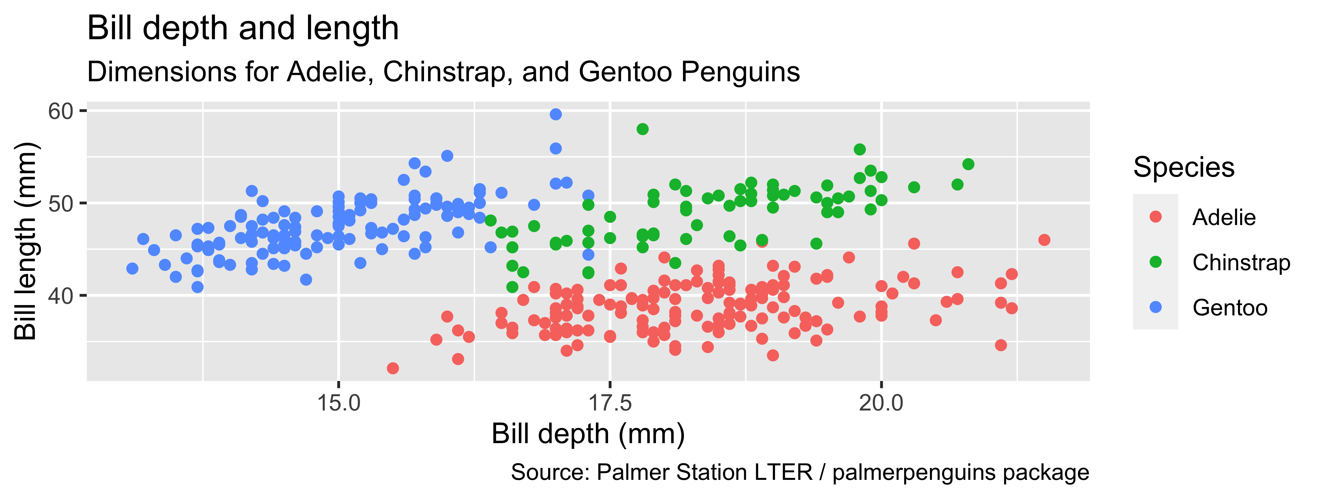
Start with the
penguinsdata frame, map bill depth to the x-axis and map bill length to the y-axis. Represent each observation with a point and map species to the color of each point. Title the plot “Bill depth and length”, add the subtitle “Dimensions for Adelie, Chinstrap, and Gentoo Penguins”, label the x and y axes as “Bill depth (mm)” and “Bill length (mm)”, respectively, label the legend “Species”, and add a caption for the data source. Finally, use a discrete color scale that is designed to be perceived by viewers with common forms of color blindness.
ggplot(data = penguins,
       mapping = aes(x = bill_depth_mm,
                     y = bill_length_mm,
                     color = species)) +
  geom_point() +
  labs(title = "Bill depth and length",
       subtitle = "Dimensions for Adelie, Chinstrap, and Gentoo Penguins",
       x = "Bill depth (mm)", y = "Bill length (mm)",
       color = "Species",
caption = "Source: Palmer Station LTER / palmerpenguins package") +
scale_color_viridis_d() 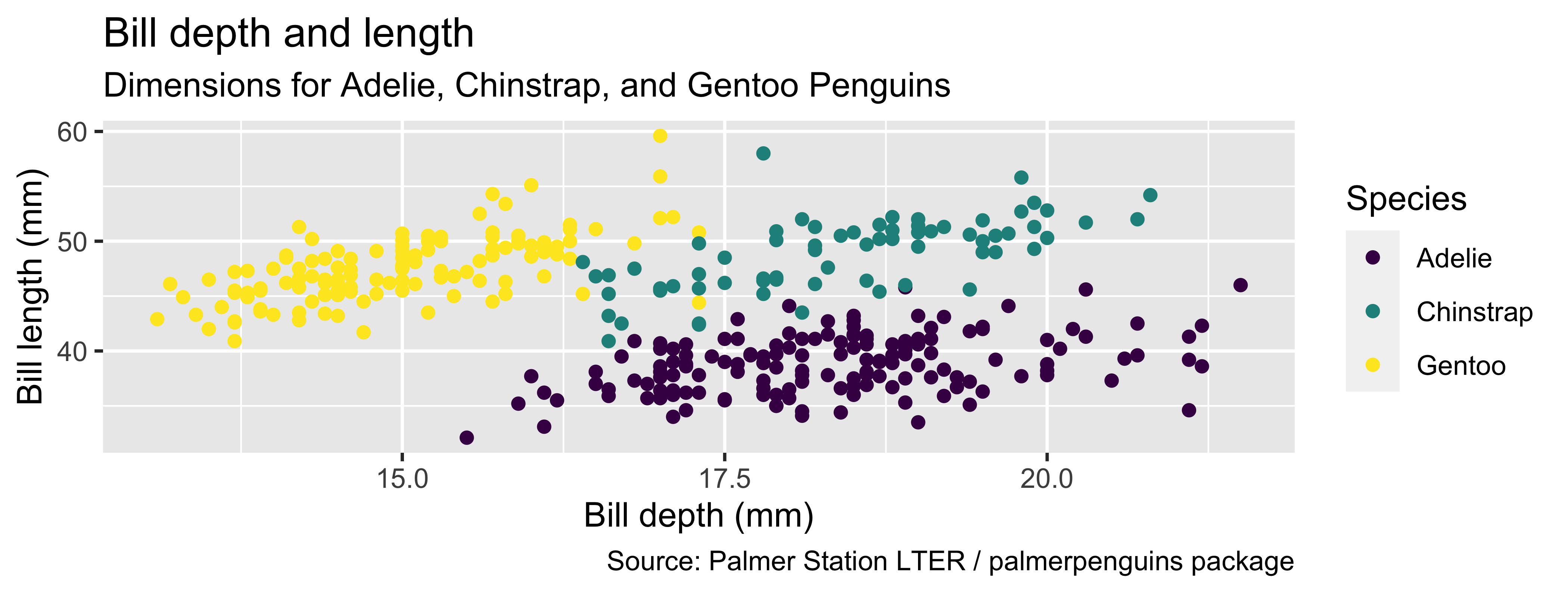
Coding out loud
ggplot(data = penguins,
       mapping = aes(x = bill_depth_mm,
                     y = bill_length_mm,
                     color = species)) +
  geom_point() +
  labs(title = "Bill depth and length",
       subtitle = "Dimensions for Adelie, Chinstrap, and Gentoo Penguins",
       x = "Bill depth (mm)", y = "Bill length (mm)",
       color = "Species",
       caption = "Source: Palmer Station LTER / palmerpenguins package") +
scale_color_viridis_d()Warning: Removed 2 rows containing missing values (`geom_point()`).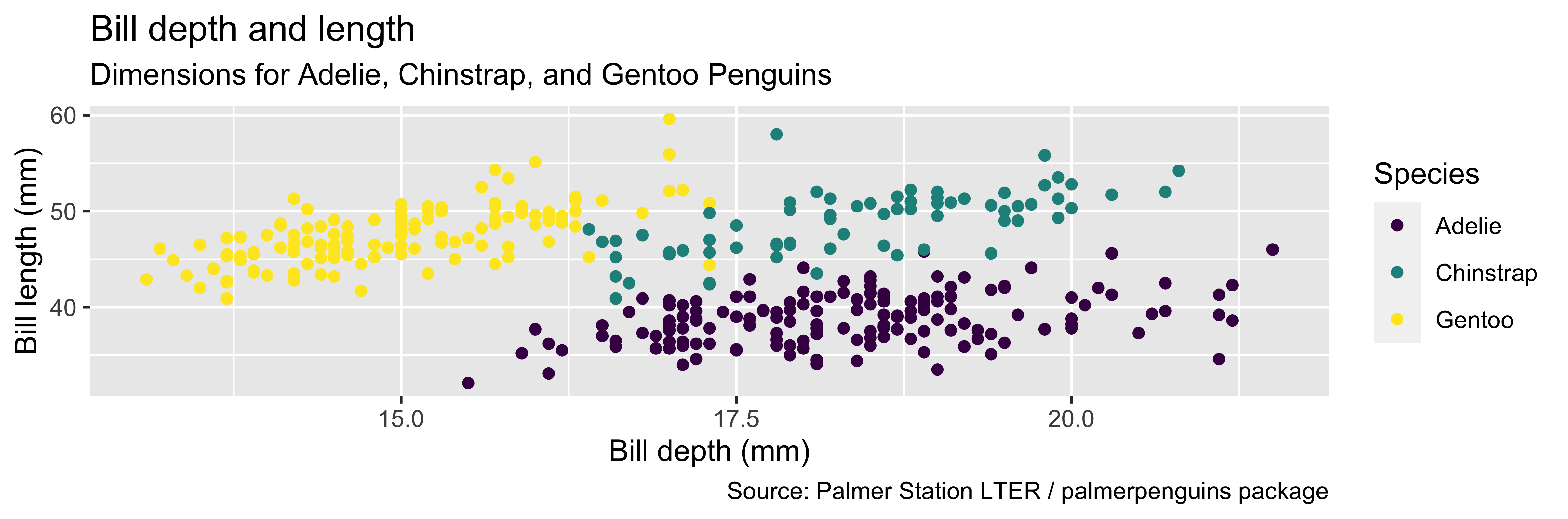
Start with the penguins data frame, map bill depth to the x-axis and map bill length to the y-axis.
Represent each observation with a point and map species to the color of each point.
Title the plot “Bill depth and length”, add the subtitle “Dimensions for Adelie, Chinstrap, and Gentoo Penguins”, label the x and y axes as “Bill depth (mm)” and “Bill length (mm)”, respectively, label the legend “Species”, and add a caption for the data source.
Finally, use a discrete color scale that is designed to be perceived by viewers with common forms of color blindness.
Argument names
Tip
You can omit the names of first two arguments when building plots with ggplot().
Your Turn
Generate a basic plot in ggplot2 using different variables than those in the last example (last example: bill_depth_mm & bill_depth_mm).
Put a green sticky on the front of your computer when you’re done. Put a pink if you want help/have a question.
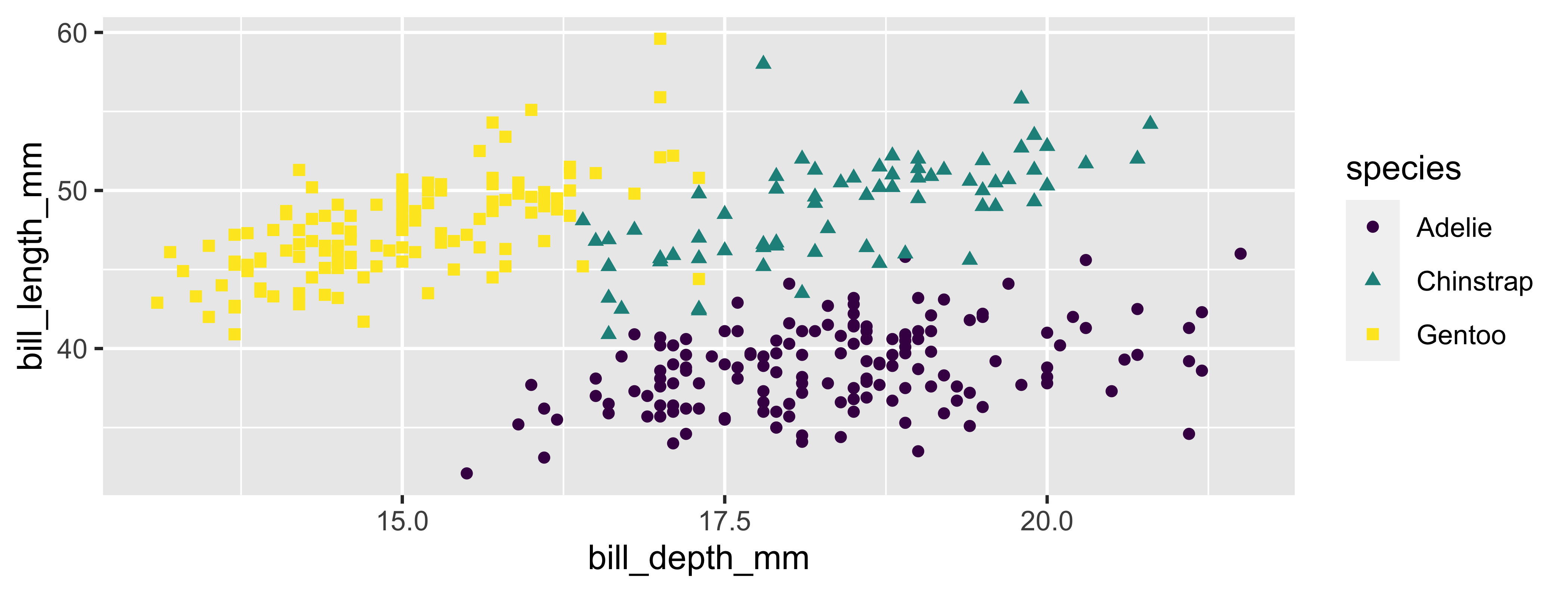
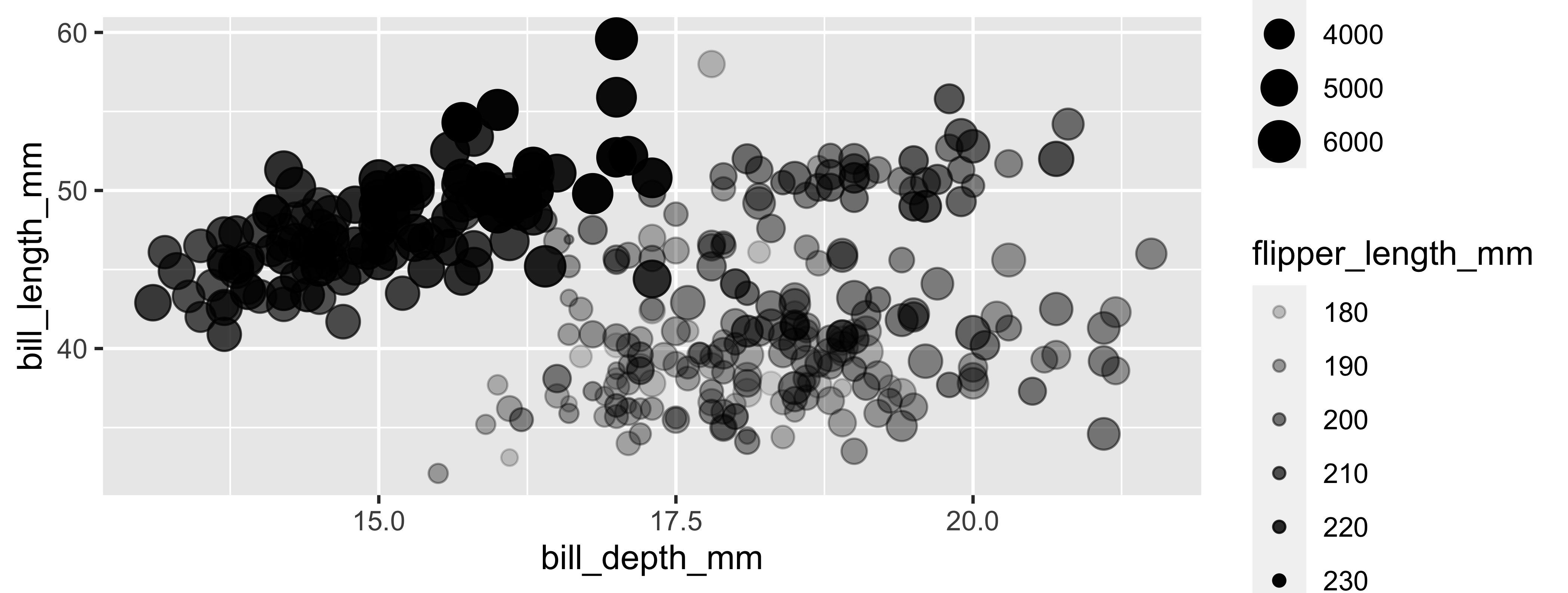
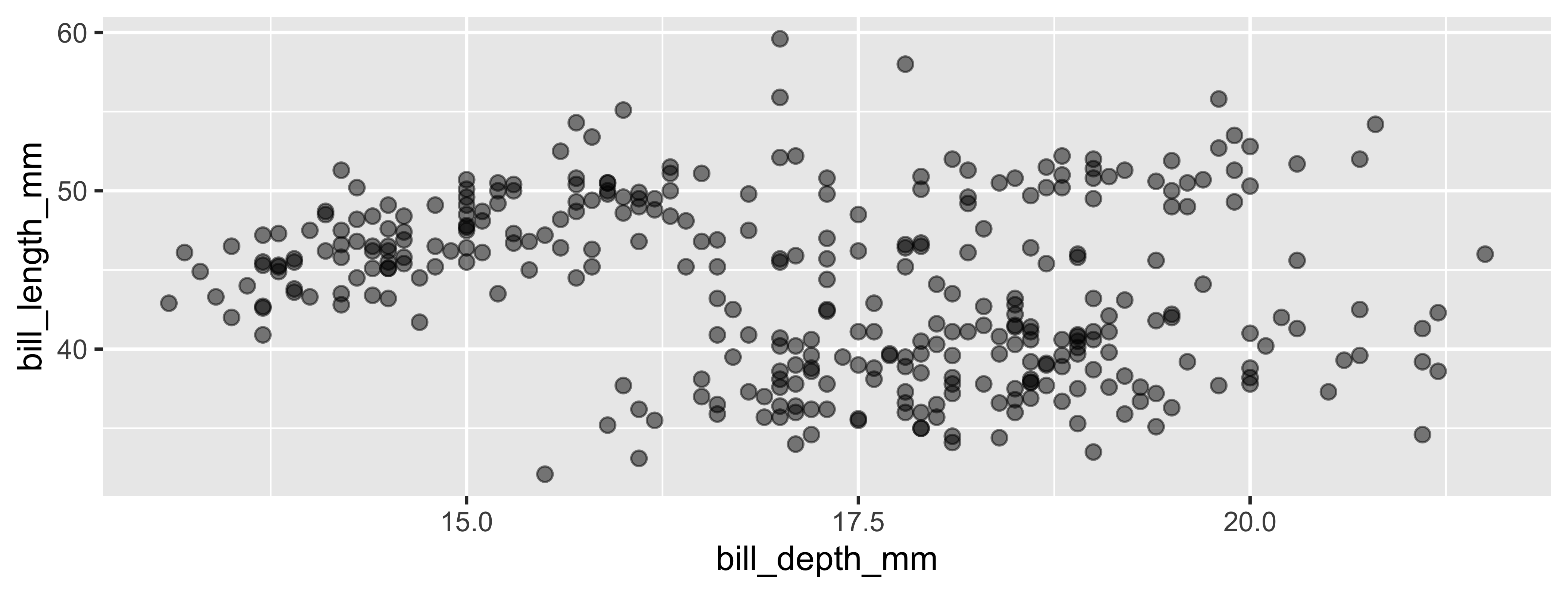
Aesthetics
Aesthetics options
Commonly used characteristics of plotting characters that can be mapped to a specific variable in the data are
colorshapesizealpha(transparency)
Color
Shape
Mapped to a different variable than color
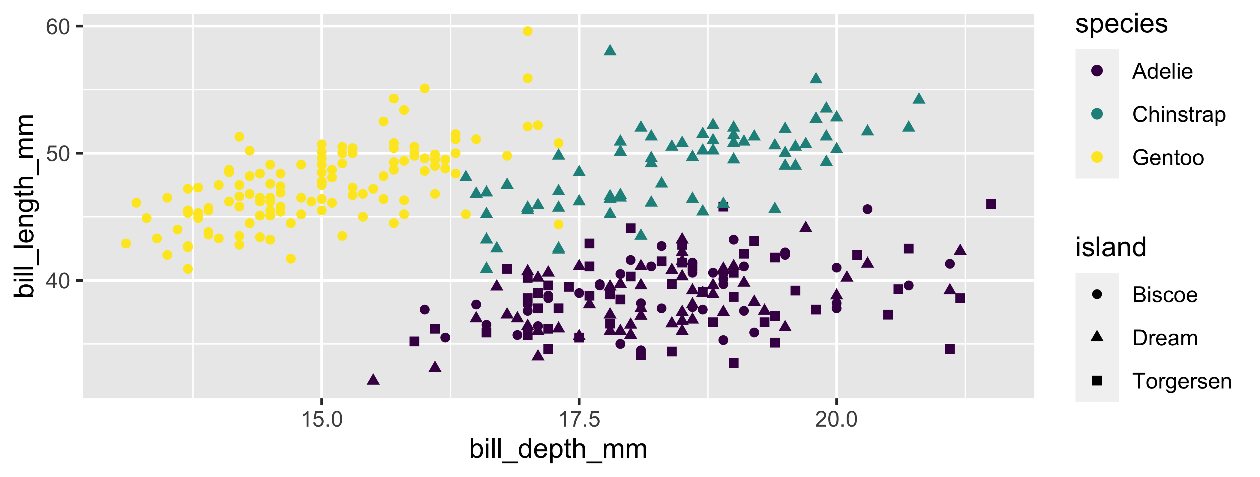
Shape
Mapped to same variable as color
Size
Alpha
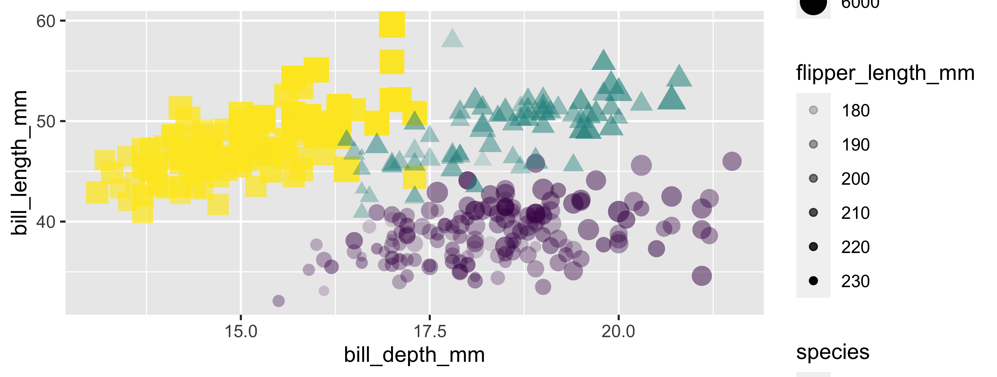
Mapping vs. setting
- Mapping: Determine the size, alpha, etc. of points based on the values of a variable in the data
- goes into
aes()
- goes into
- Setting: Determine the size, alpha, etc. of points not based on the values of a variable in the data
- goes into
geom_*()(this wasgeom_point()in the previous example, but we’ll learn about other geoms soon!)
- goes into
Mapping vs. Setting (example)
Your Turn
Edit the basic plot you created earlier to change something about its aesthetics.
Put a green sticky on the front of your computer when you’re done. Put a pink if you want help/have a question.
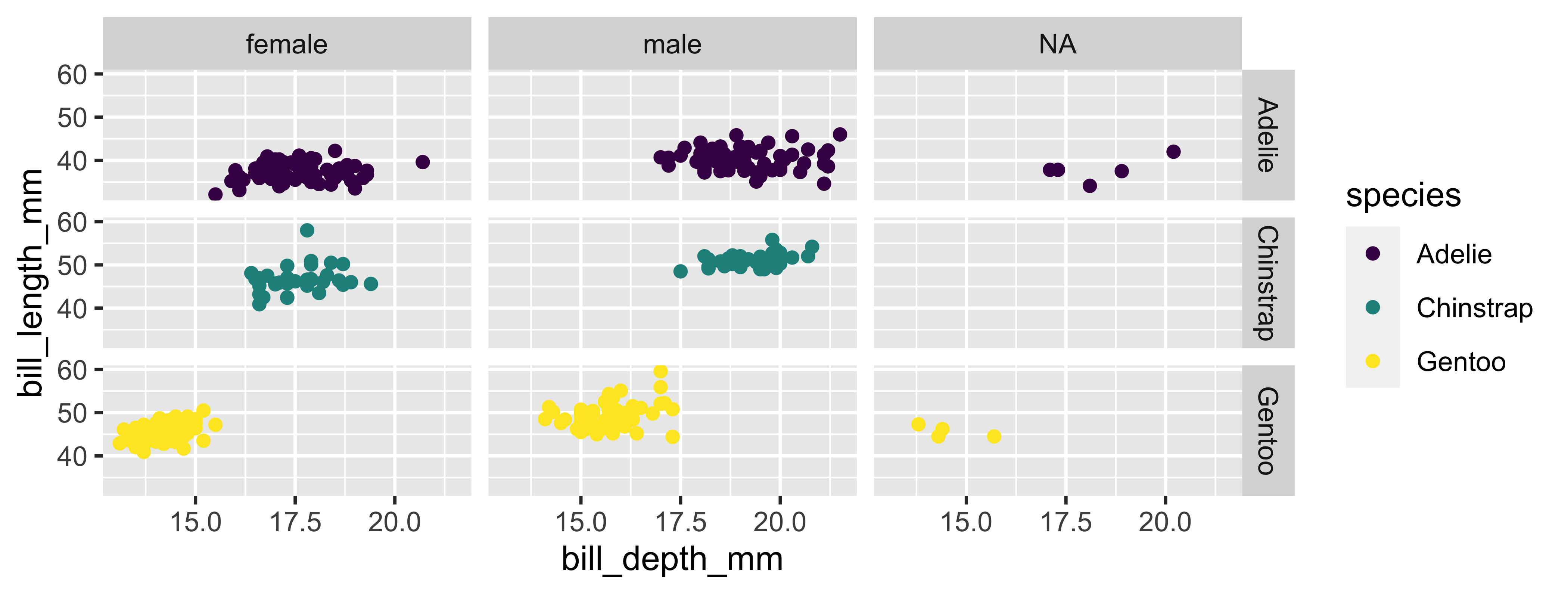
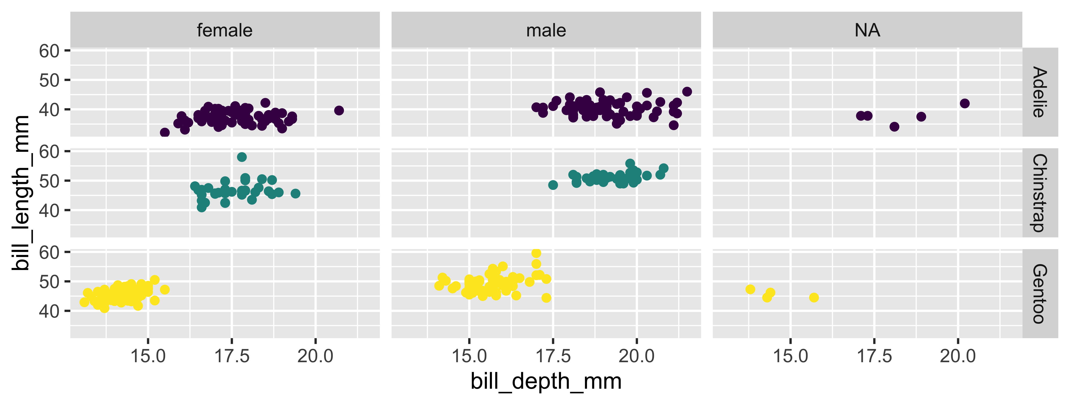
Faceting
Faceting
- Smaller plots that display different subsets of the data
- Useful for exploring conditional relationships and large data
. . .
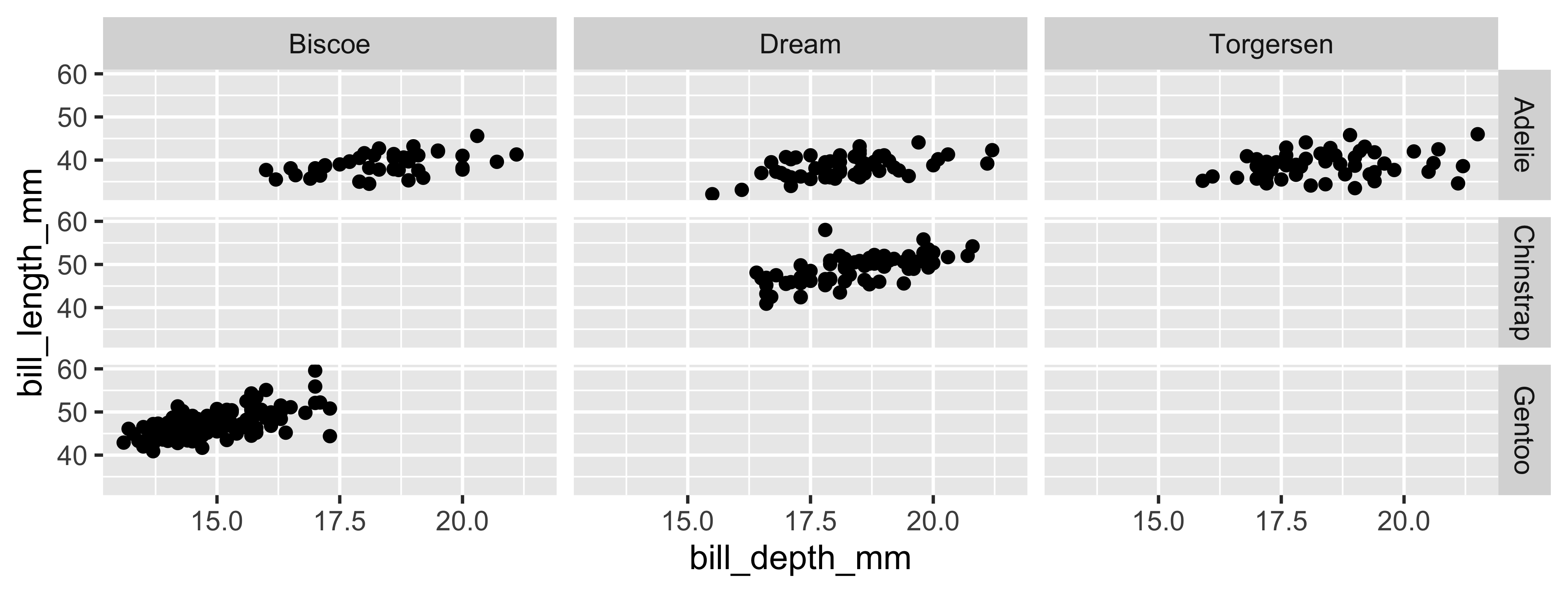
Various ways to facet
🧠 In the next few slides describe what each plot displays. Think about how the code relates to the output.
Warning
The plots in the next few slides do not have proper titles, axis labels, etc. because we want you to figure out what’s happening in the plots. But you should always label your plots!
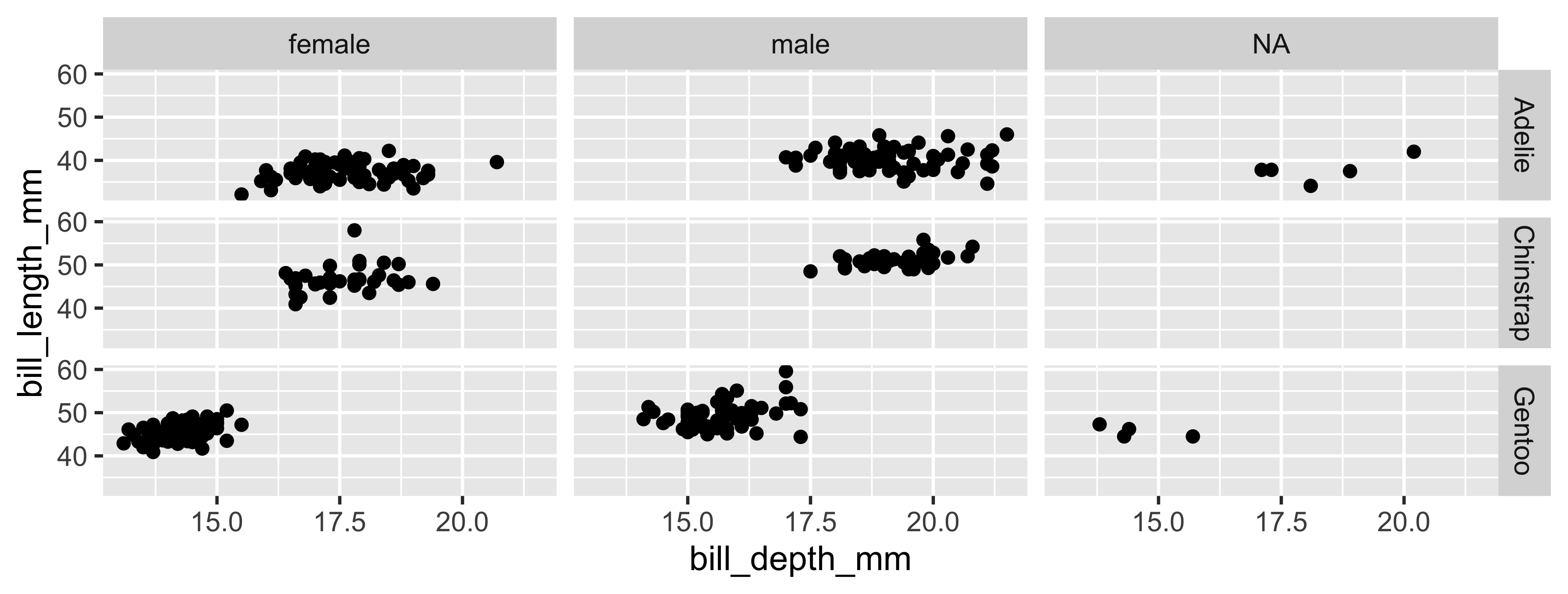
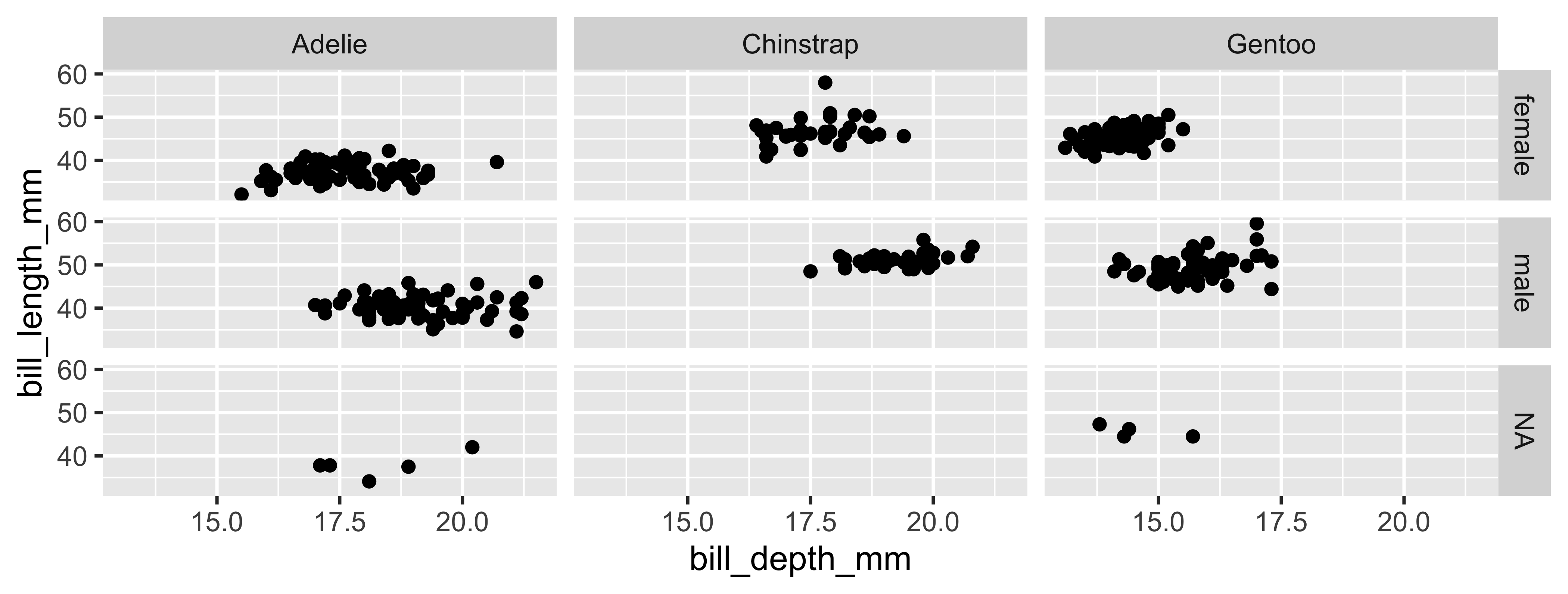
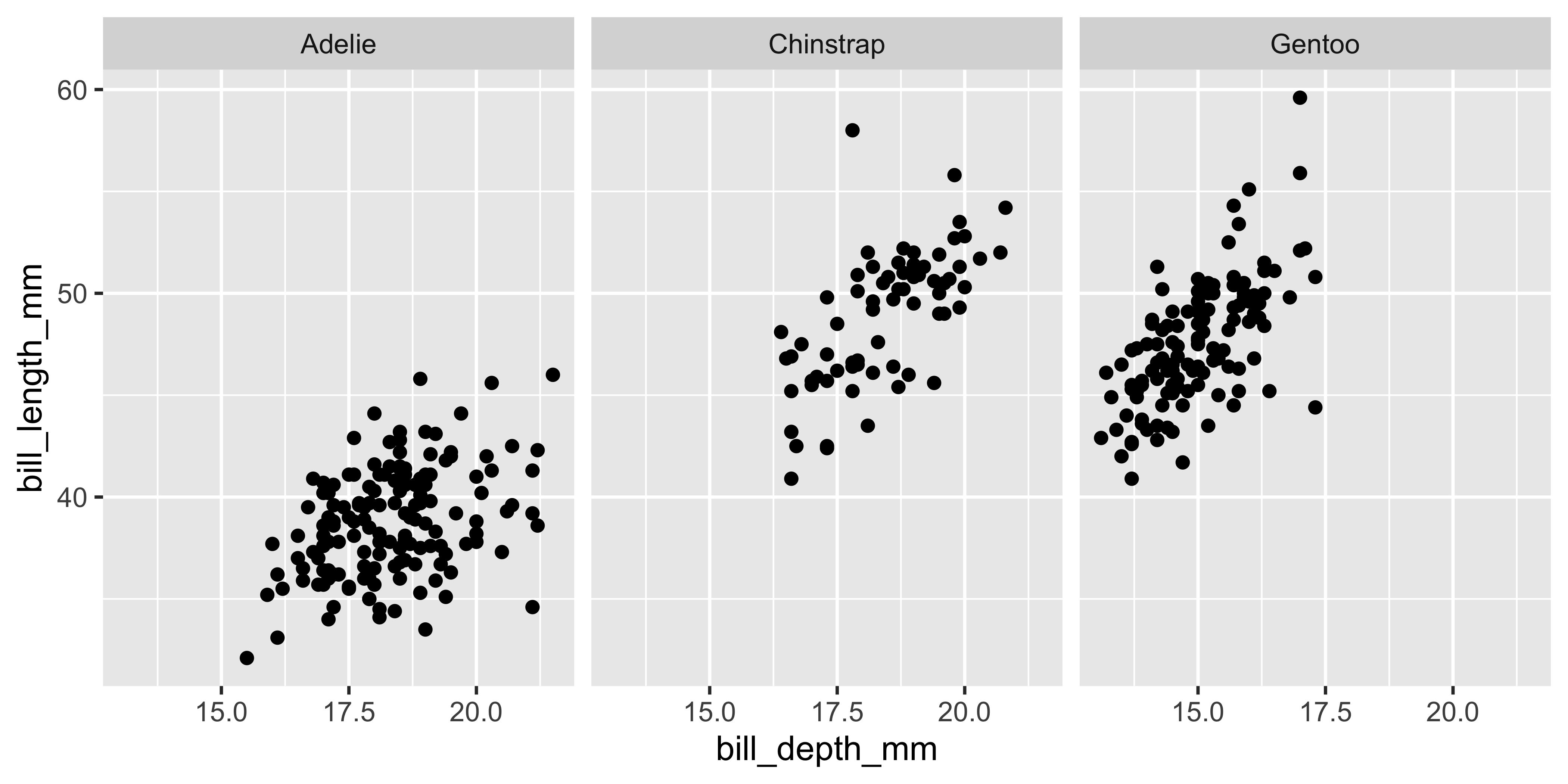

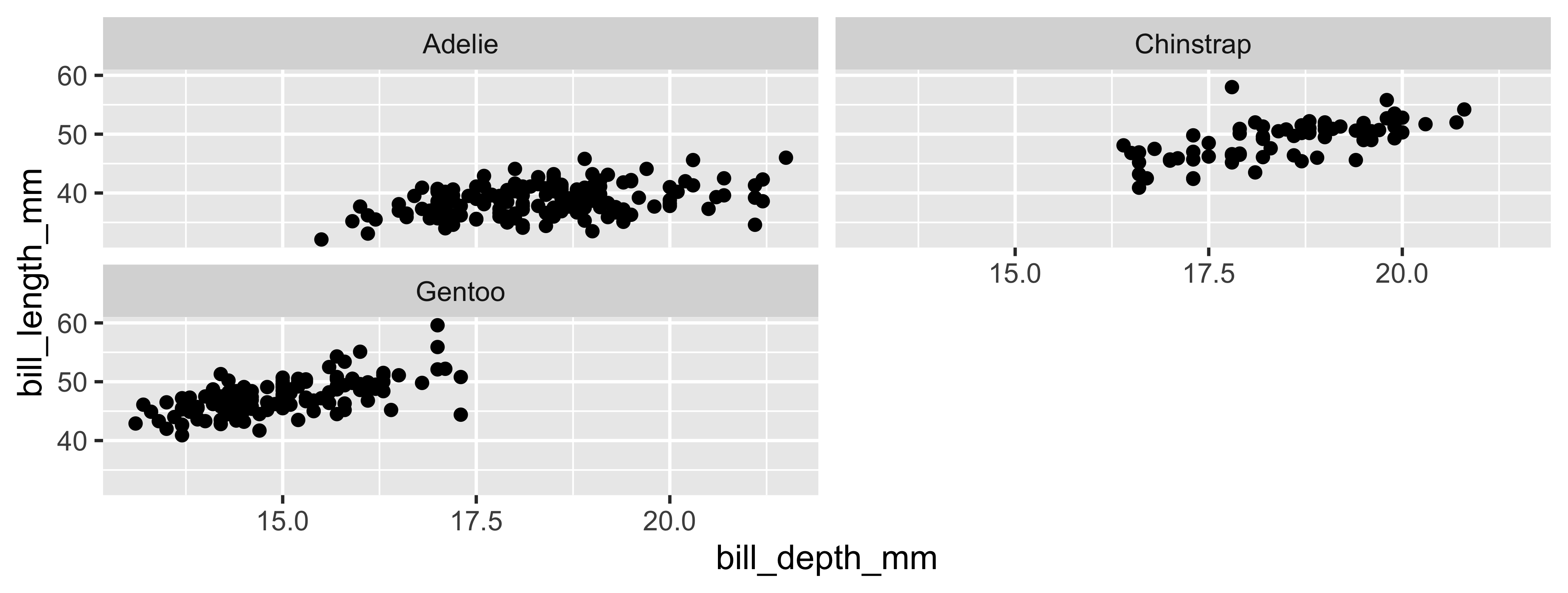
Faceting summary
facet_grid():- 2d grid
rows ~ cols- use
.for no split
facet_wrap(): 1d ribbon wrapped according to number of rows and columns specified or available plotting area
Facet and color
Face and color, no legend
geoms
Common geoms
geom 1 |
Description 2 |
|---|---|
geom_point |
scatterplot |
geom_bar |
barplot |
geom_line |
line plot |
geom_density |
densityplot |
geom_histogram |
histogram |
geom_boxplot |
boxplot |
Your Turn
Generate a plot in ggplot2 using a different geom than what you did previously. Customize as much as you can before time is “up.”
Put a green sticky on the front of your computer when you’re done. Put a pink if you want help/have a question.
Recap
- Can I explain the overall structure of a call to generate a plot in
ggplot2? - Can I describe
ggplot2code? Can I create plots usingggplot2? - Can I alter the aesthetics of a basic plot? (color, shape, size, transparency)
- Am I able to facet a plot to generate a grid of figures
- Can I describe what a
geomis and do I know the basic plots available?