05-viz
Effective Data Visualization
Slides modified from datascienceinabox.org
Q&A
Q: I just think it’s a bit fast and I would appreciate if you made sure to show like how to import and stuff rather then jumping to the final product
A: That’s really valuable feedback. I don’t think you’re alone. I’m going to work to better get everyone on the same page going forward.
Note: a handful of comments on needing more time on joins & pivots…which makes sense! They’re new :)
Course Announcements
Due Dates:
- Lab 03 due Friday (1/27; 11:59 PM)
- Lecture Participation survey “due” after class
Course Announcements:
- HW01 can be submitted by tonight for full credit (datahub issues)
- Lab02 Ans Posted
- HW02 Now Available
- My OH will now be at the tables along the back of this building
Suggested Reading
- R4DS Chapter 28: Graphics for Communication
- The Glamour of Graphics: [video] [slides] [Prof’s slides inspired by Will’s talk]
Keep it simple
Use color to draw attention
Tell a story
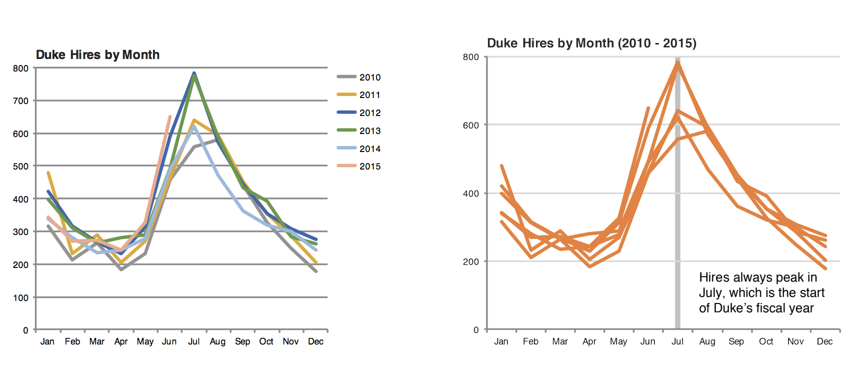
Credit: Angela Zoss and Eric Monson, Duke DVS
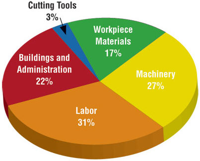
Principles for effective visualizations
Principles for effective visualizations
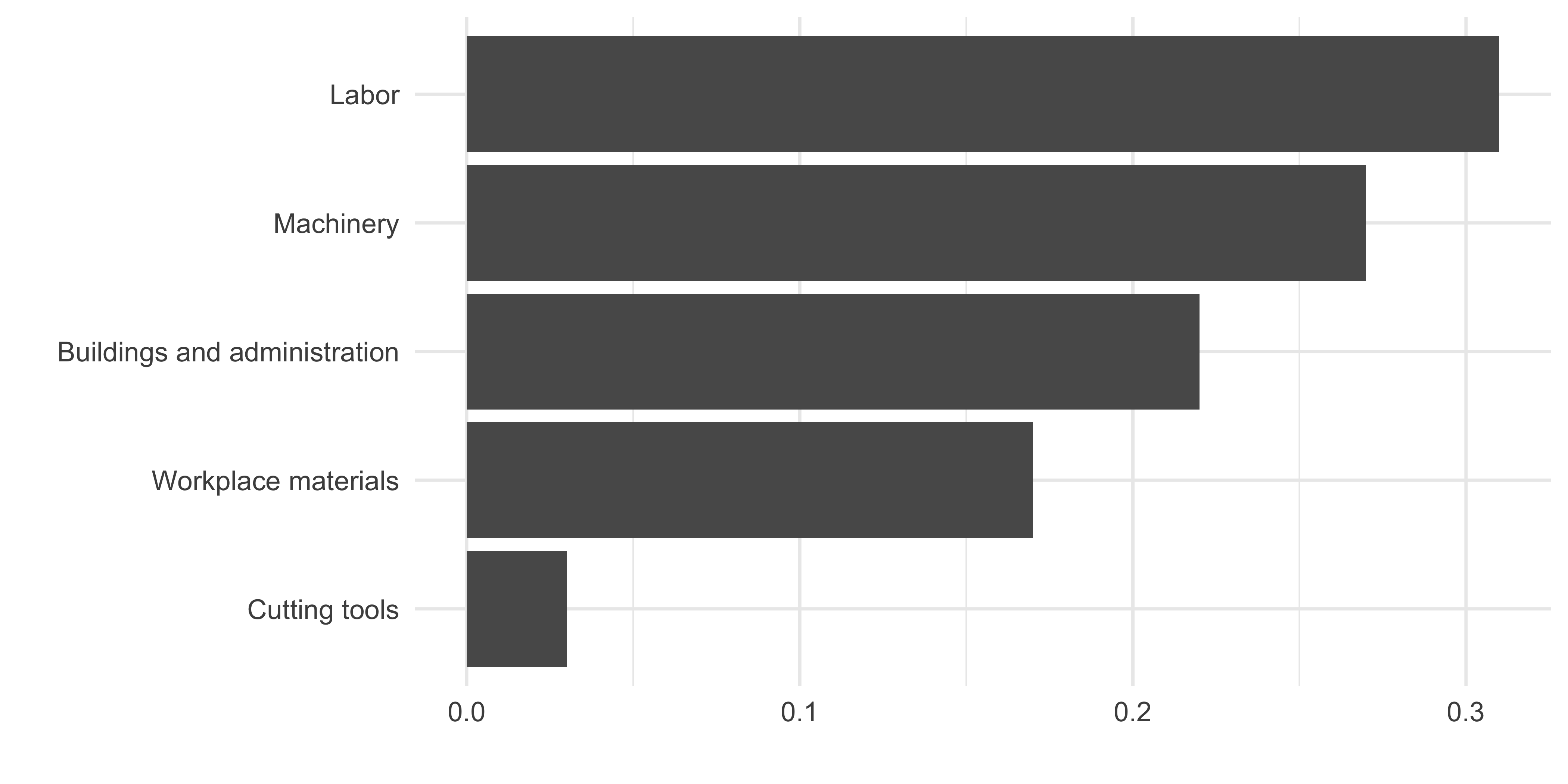
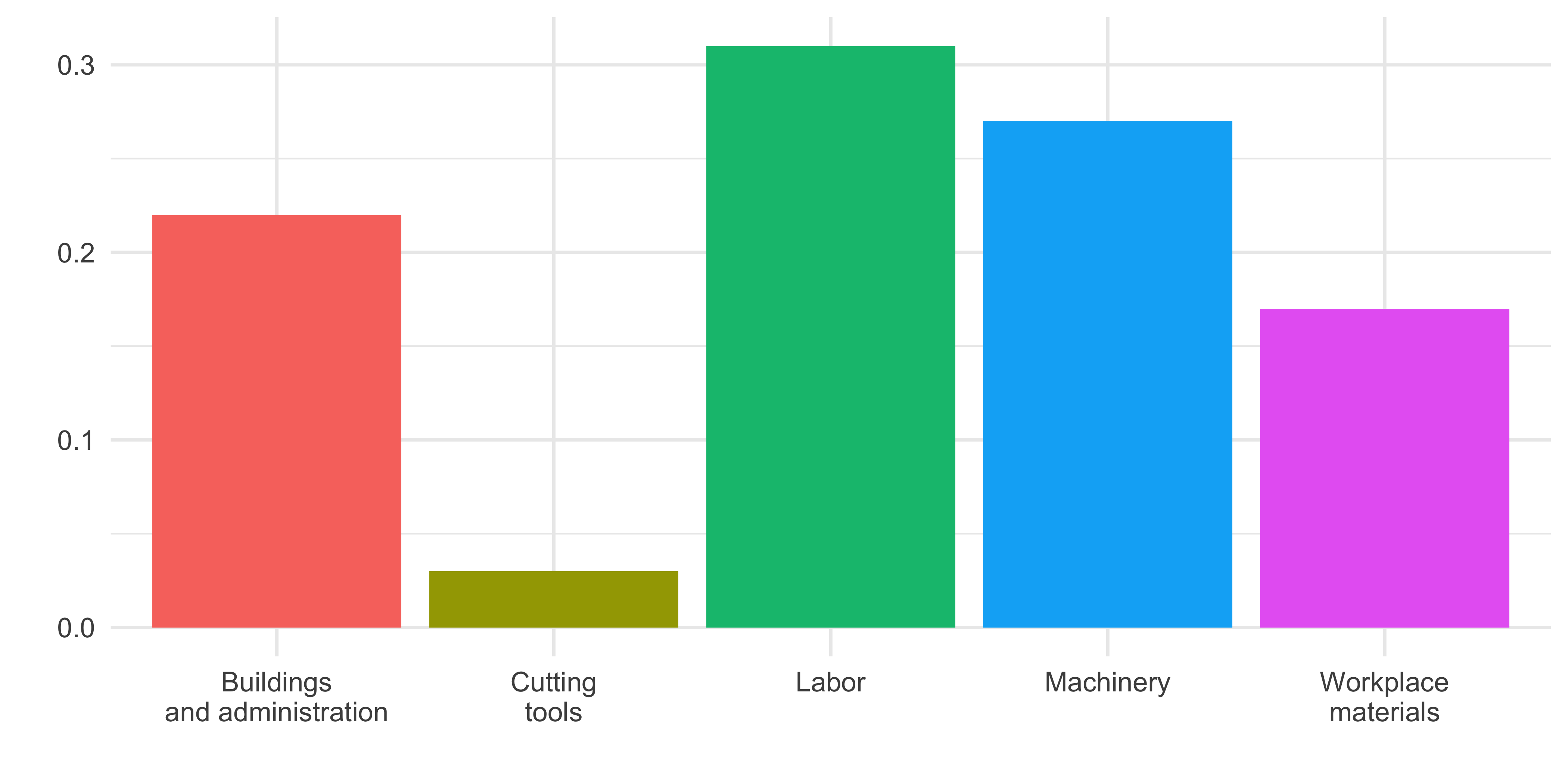
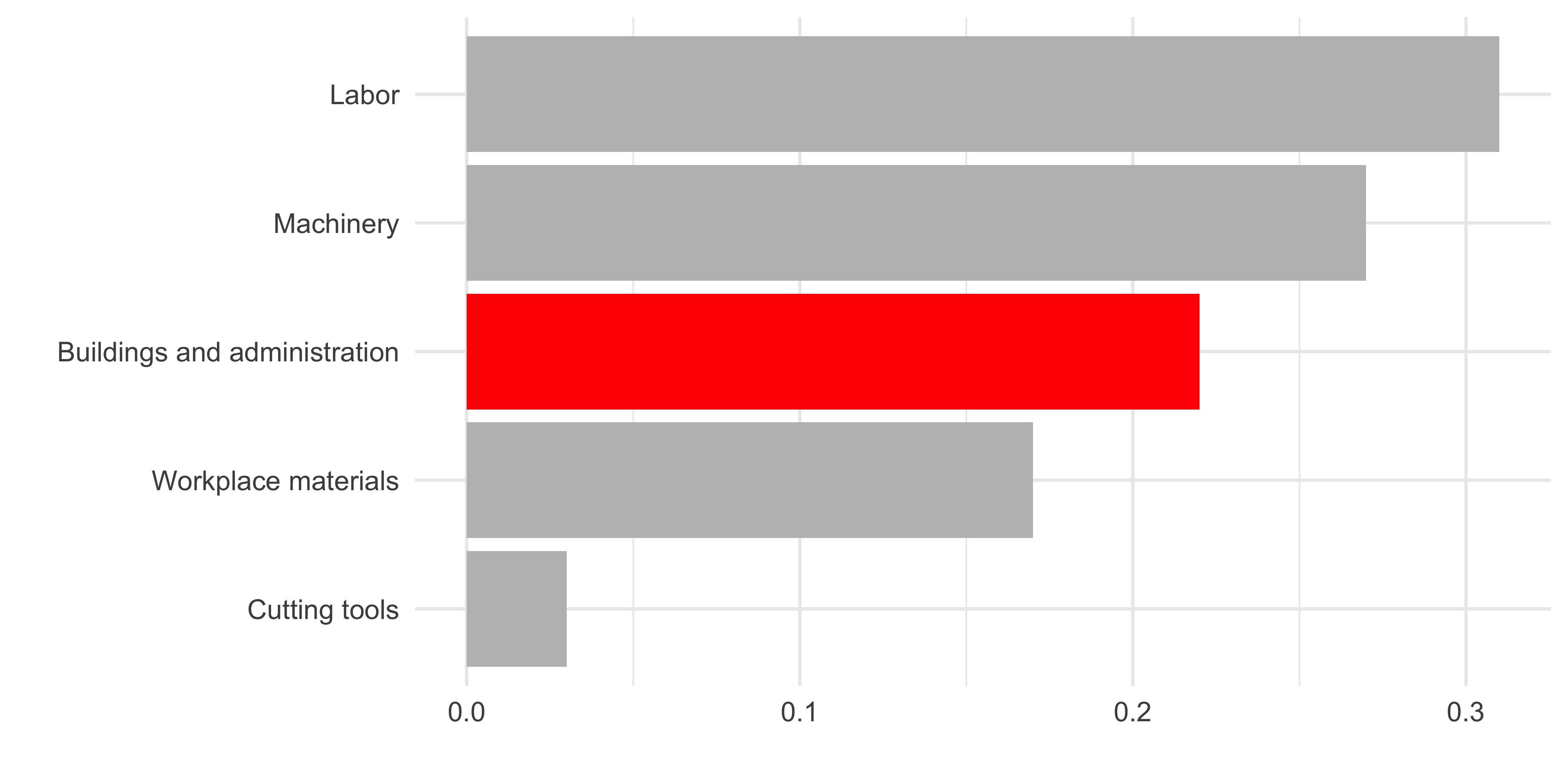
- Order matters
- Put long categories on the y-axis
- Keep scales consistent
- Select meaningful colors
- Use meaningful and nonredundant labels
Data
In September 2019, YouGov survey asked 1,639 GB adults the following question:
In hindsight, do you think Britain was right/wrong to vote to leave EU?
- Right to leave
- Wrong to leave
- Don’t know

Source: YouGov Survey Results, retrieved Oct 7, 2019
The Data: Code
brexit <- tibble(
  opinion = c(
    rep("Right", 664), rep("Wrong", 787), rep("Don't know", 188)
  ),
  region = c(
    rep("london", 63), rep("rest_of_south", 241), rep("midlands_wales", 145), rep("north", 176), rep("scot", 39),
    rep("london", 110), rep("rest_of_south", 257), rep("midlands_wales", 152), rep("north", 176), rep("scot", 92),
    rep("london", 24), rep("rest_of_south", 49), rep("midlands_wales", 57), rep("north", 48), rep("scot", 10)
  )
)
Order matters
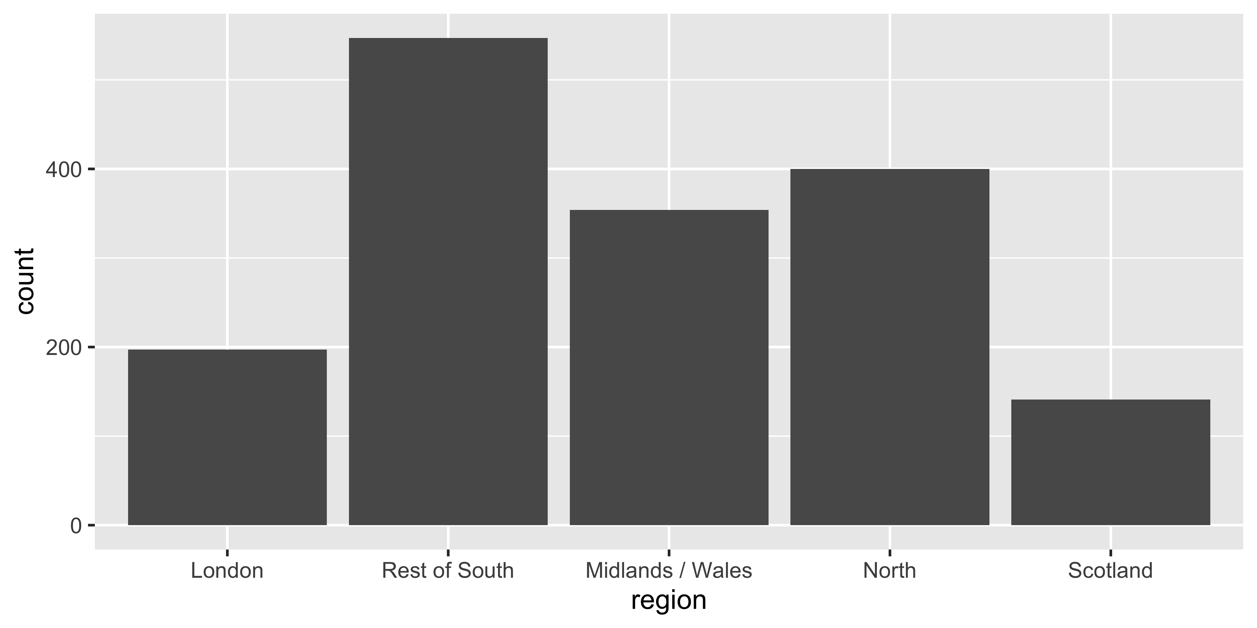
Alphabetical is rarely ideal

ggplot(brexit, aes(x = opinion)) +
  geom_bar()
Order by frequency
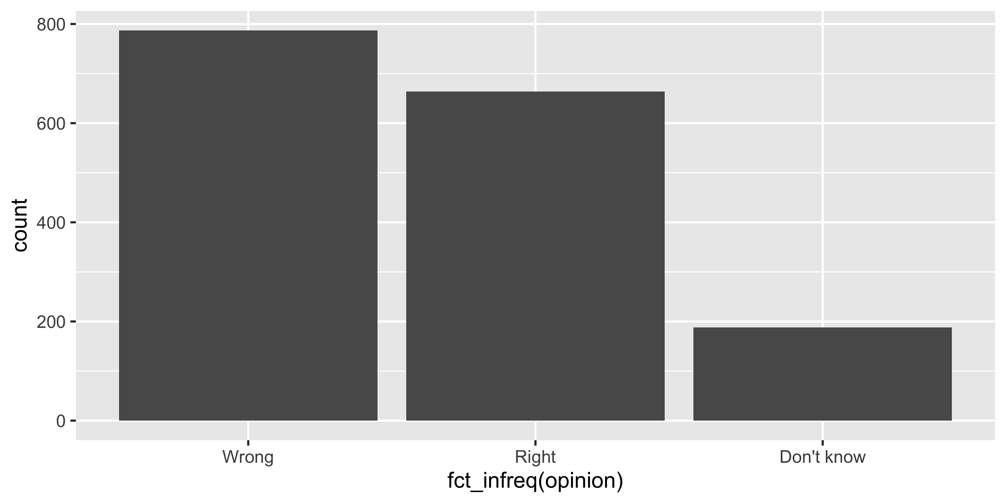
Clean up labels
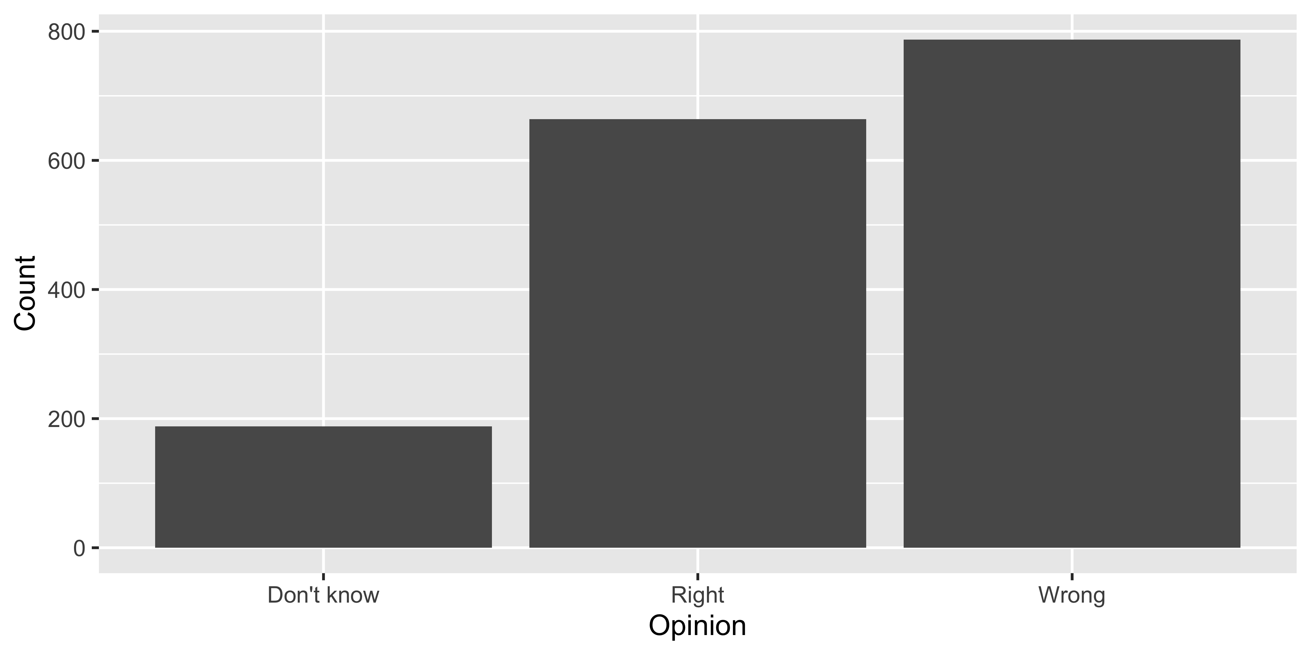
Avoiding Alphabetical Order
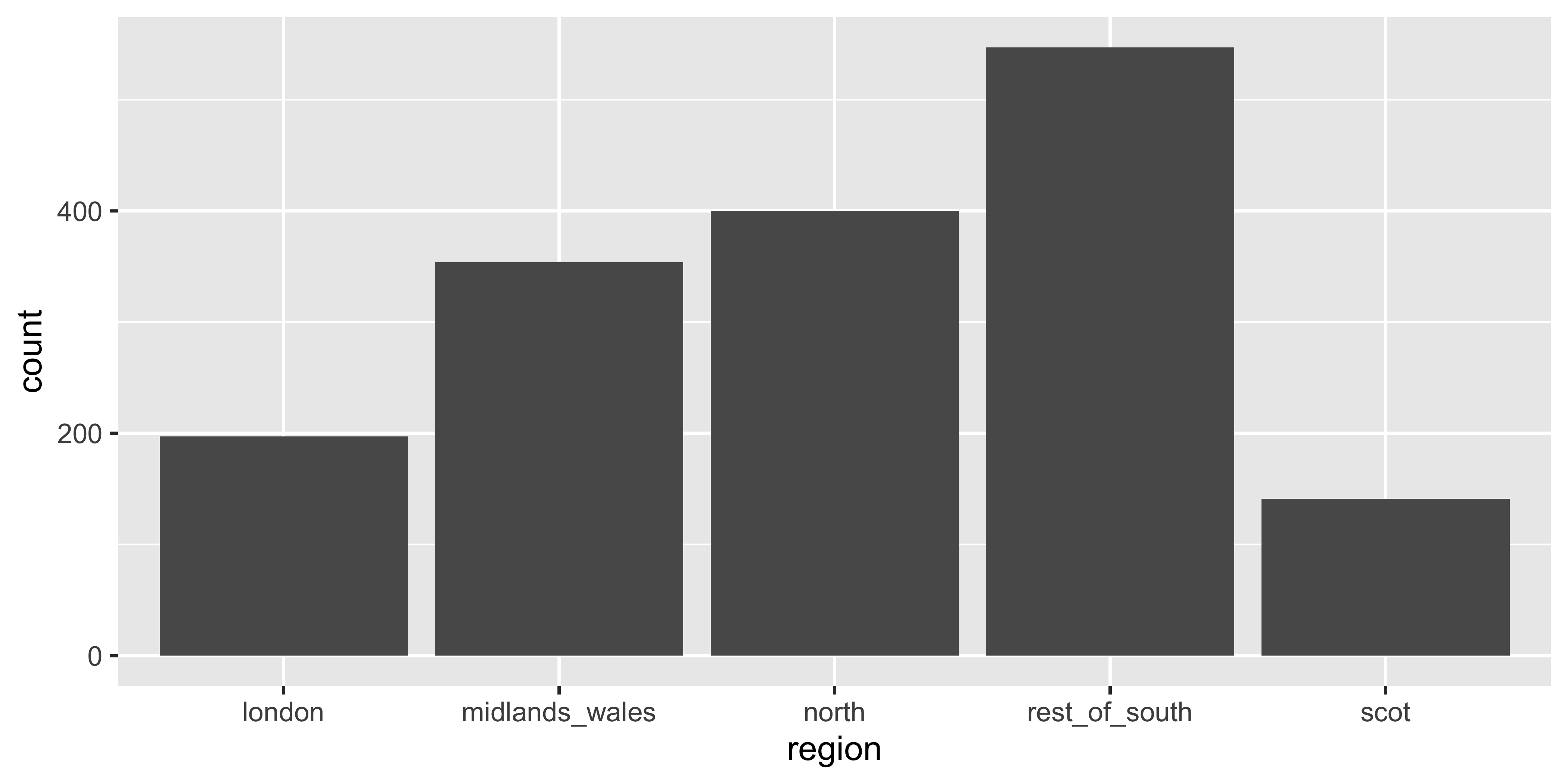
ggplot(brexit, aes(x = region)) +
  geom_bar()
Use inherent level order

Clean up labels
Put long categories on the y-axis
Long categories can be hard to read

Move them to the y-axis
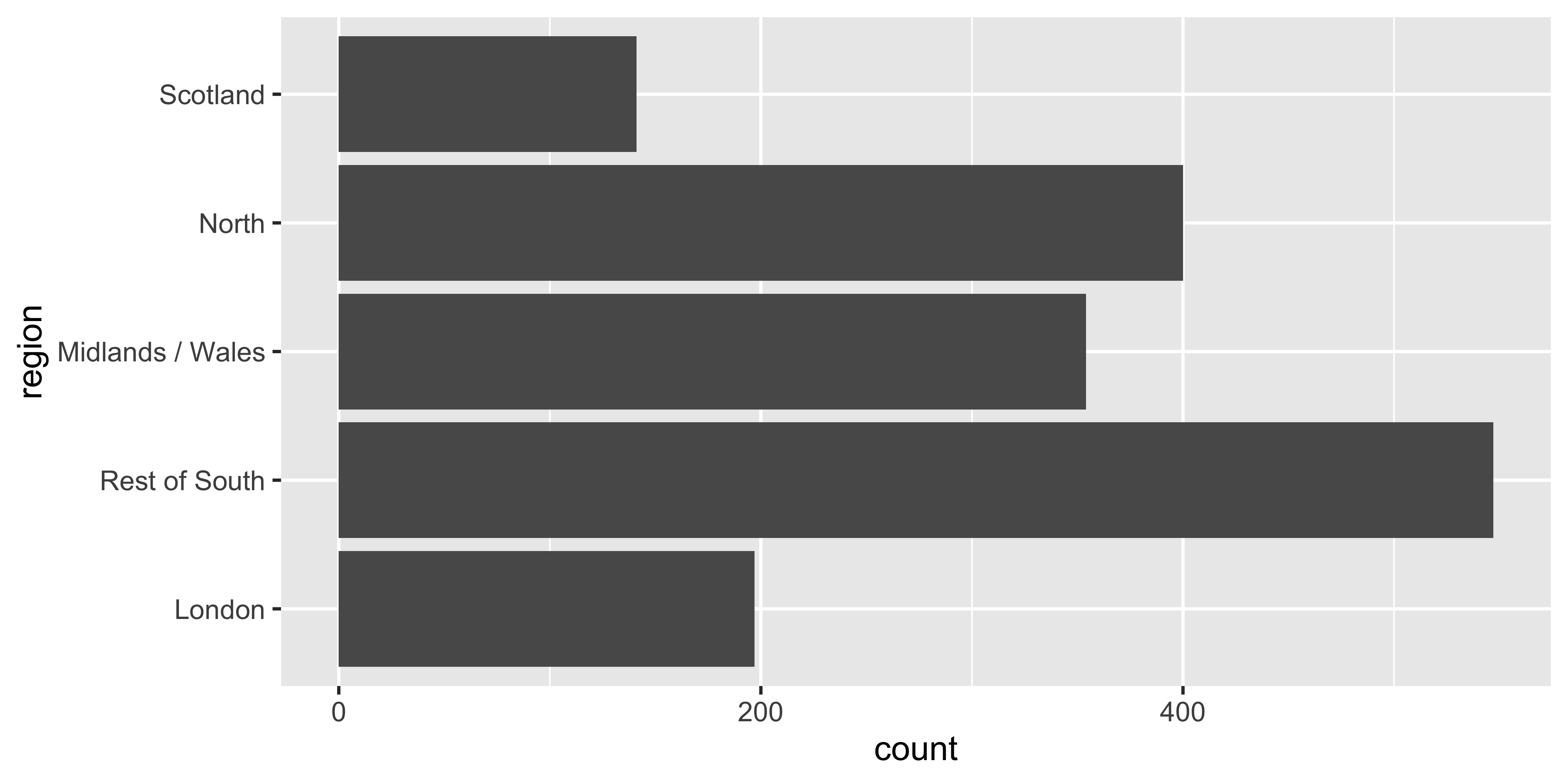
And reverse the order of levels
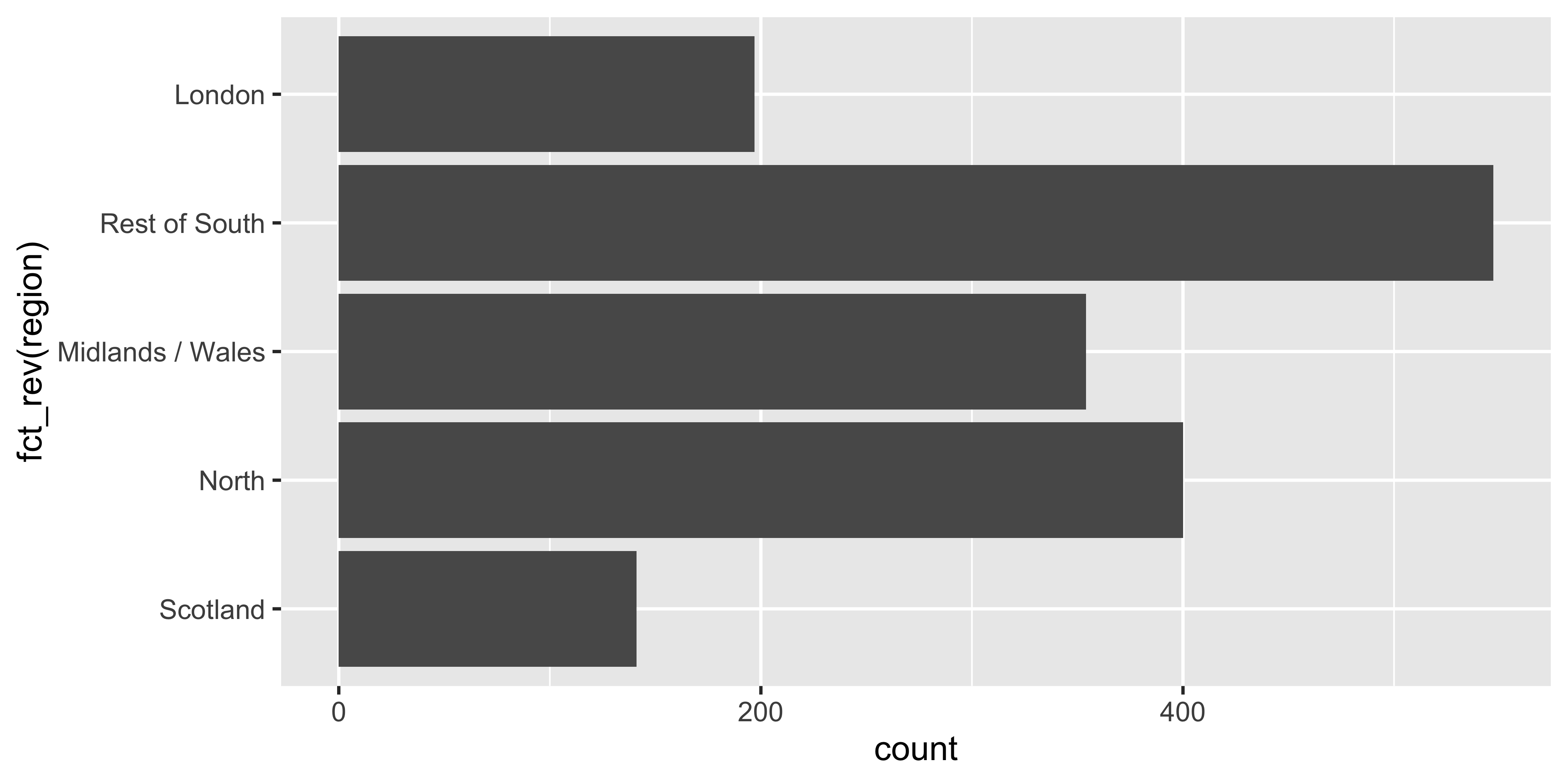
Clean up labels

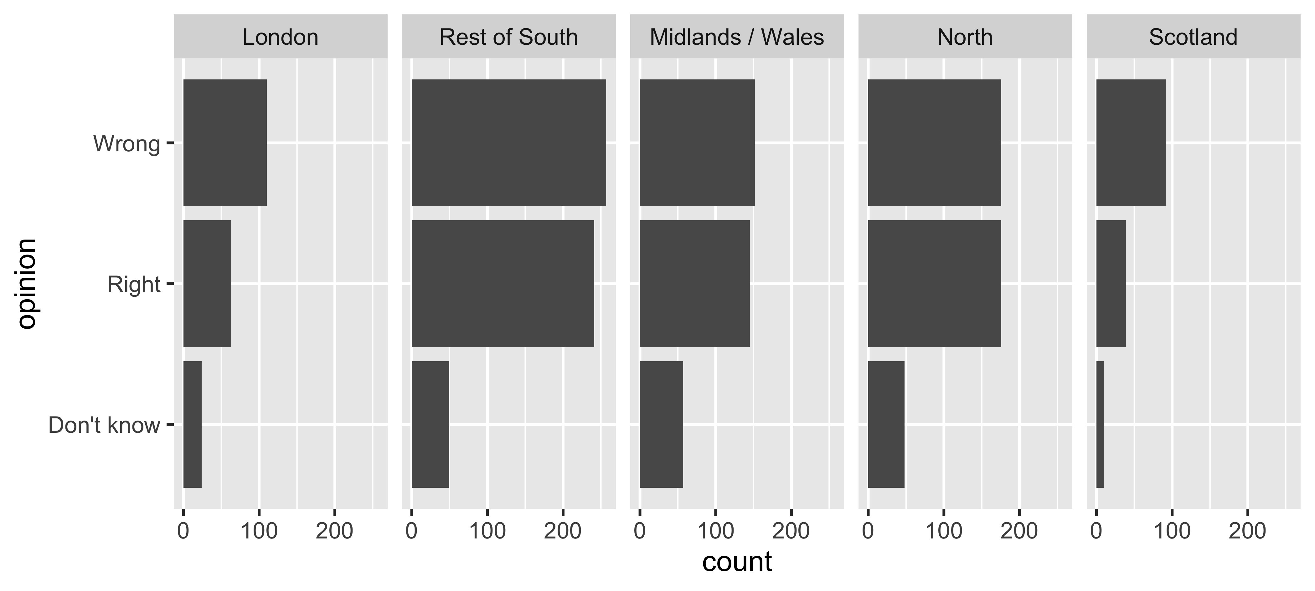
Pick a purpose
Segmented bar plots can be hard to read
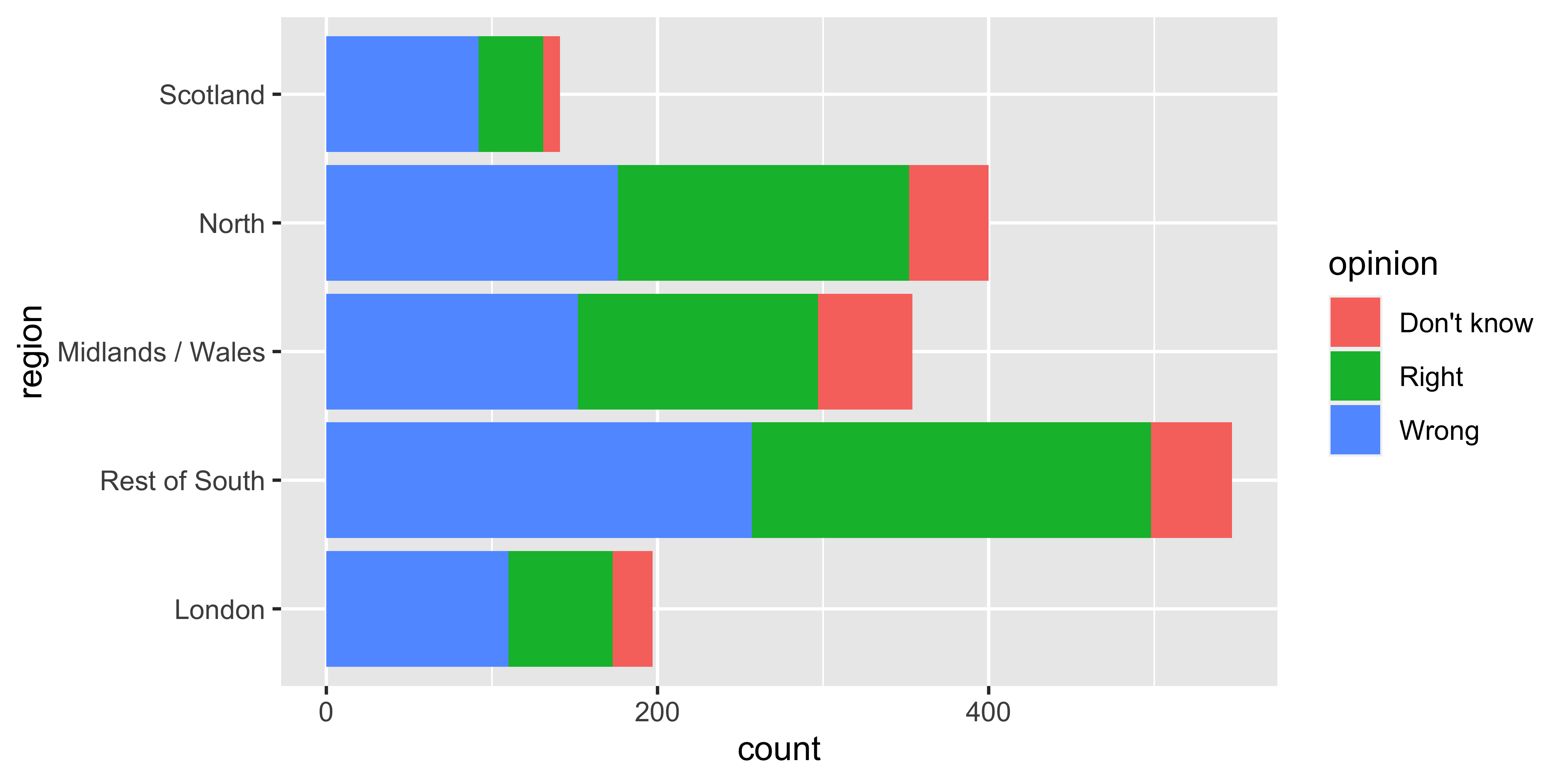
Use facets
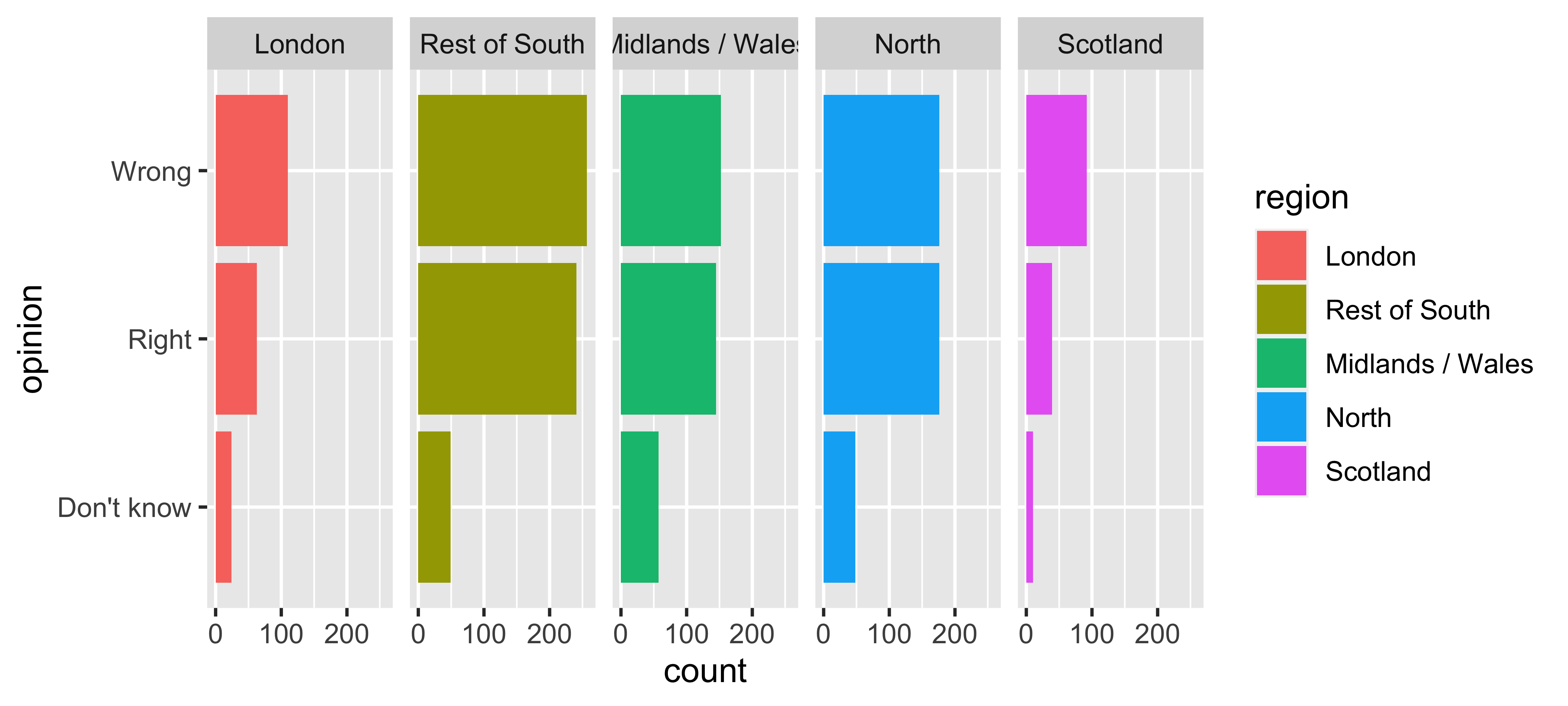
Avoid redundancy?
Redundancy can help tell a story
ggplot(brexit, aes(y = opinion, fill = opinion)) +
geom_bar() +
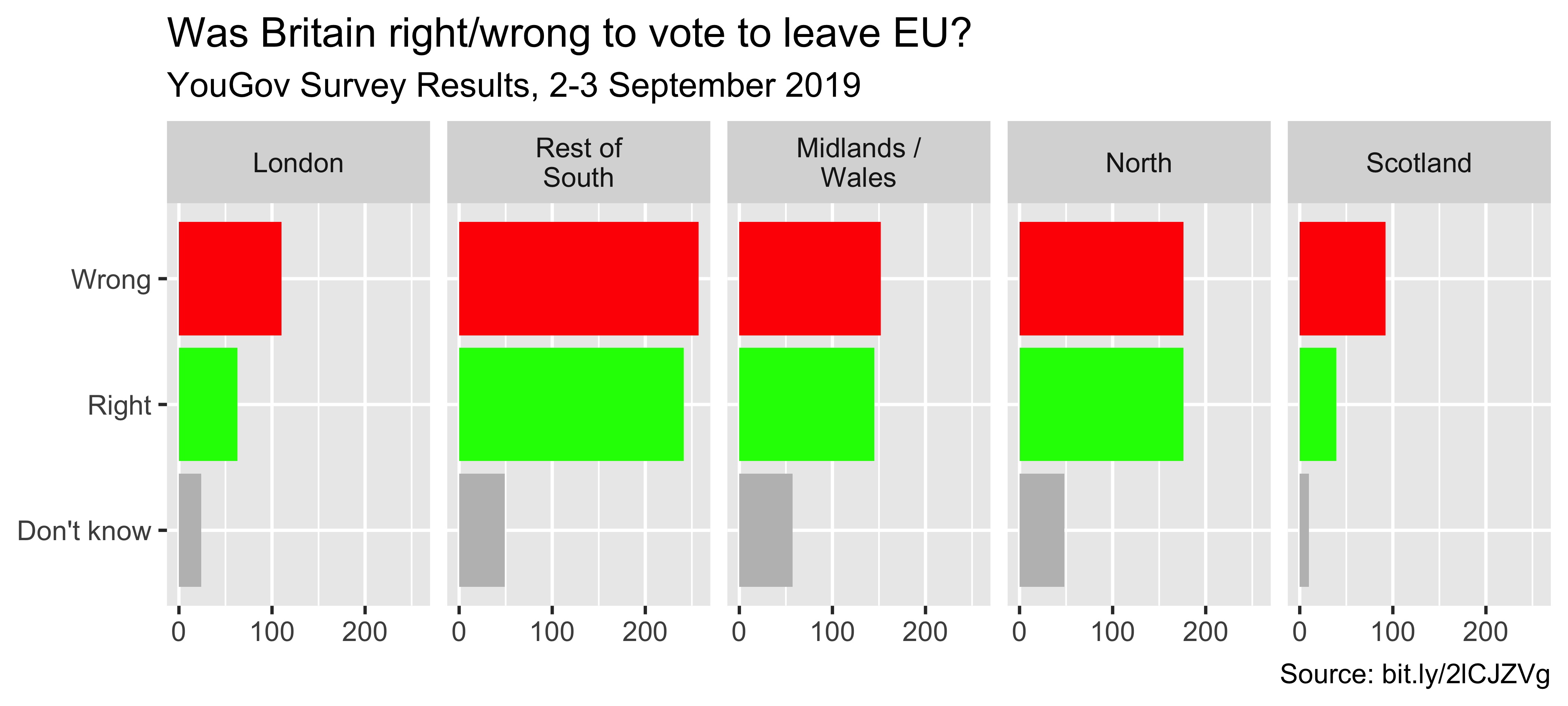
facet_wrap(~region, nrow = 1)Be selective with redundancy
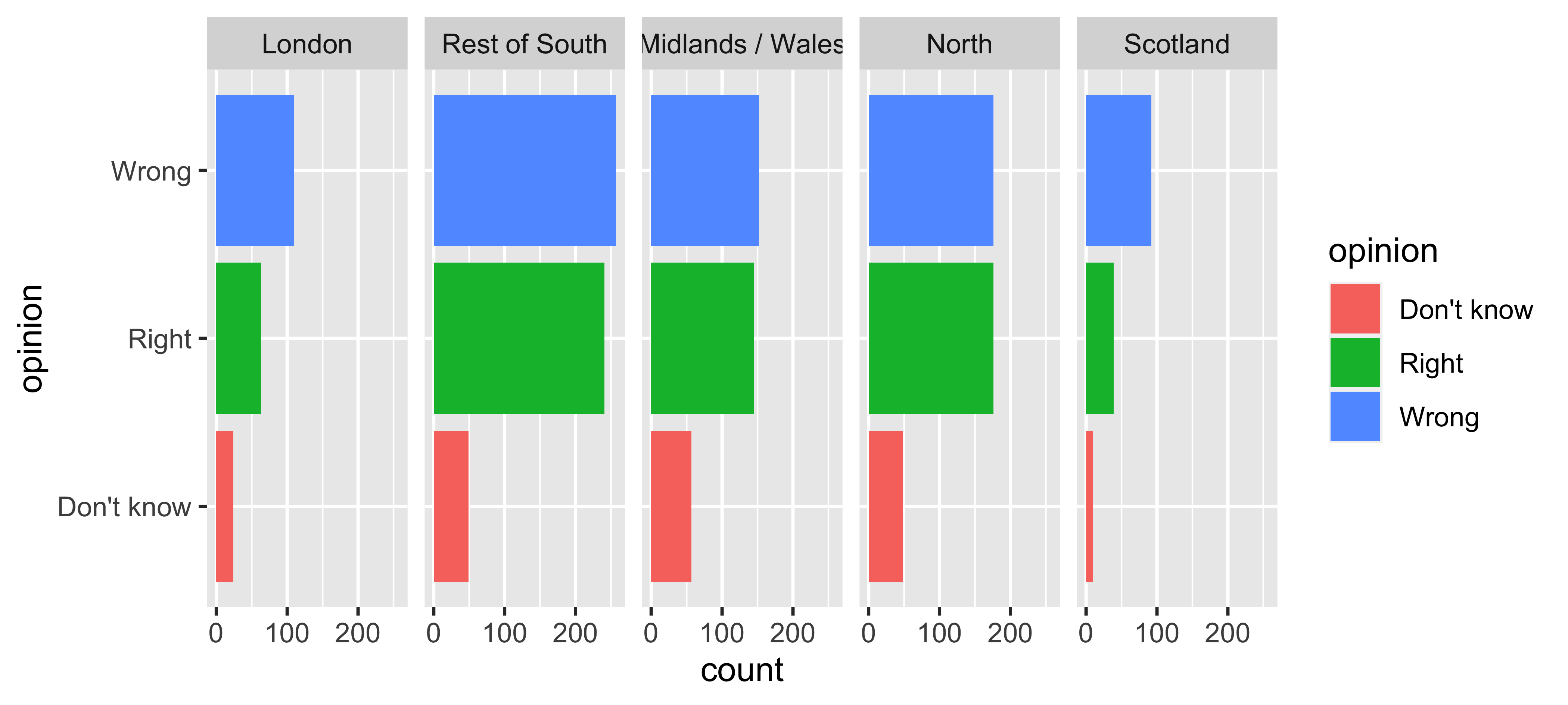
Use informative labels
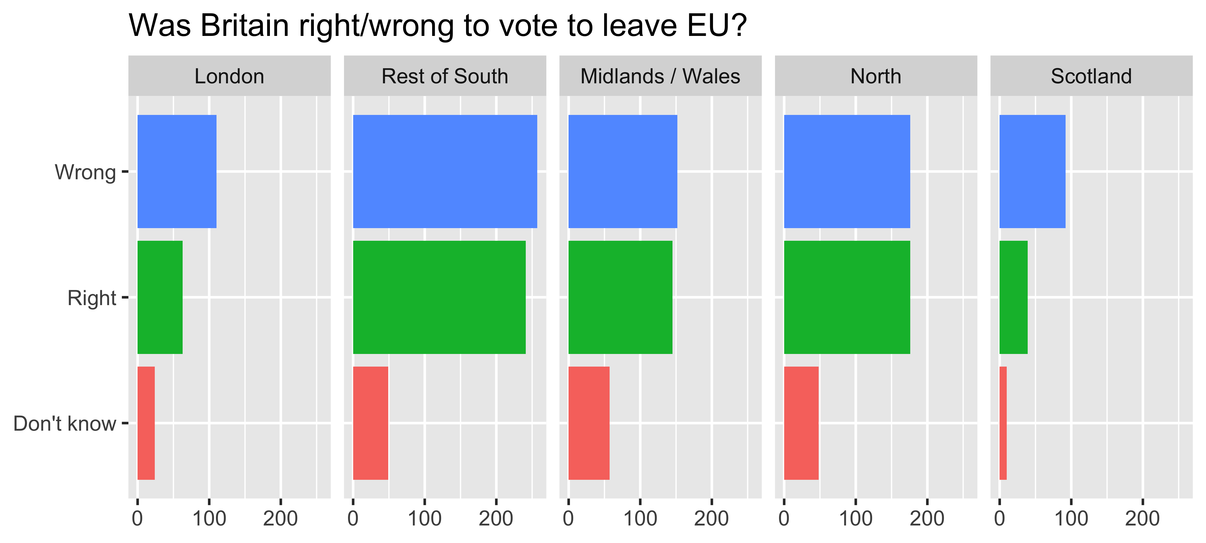
A bit more info
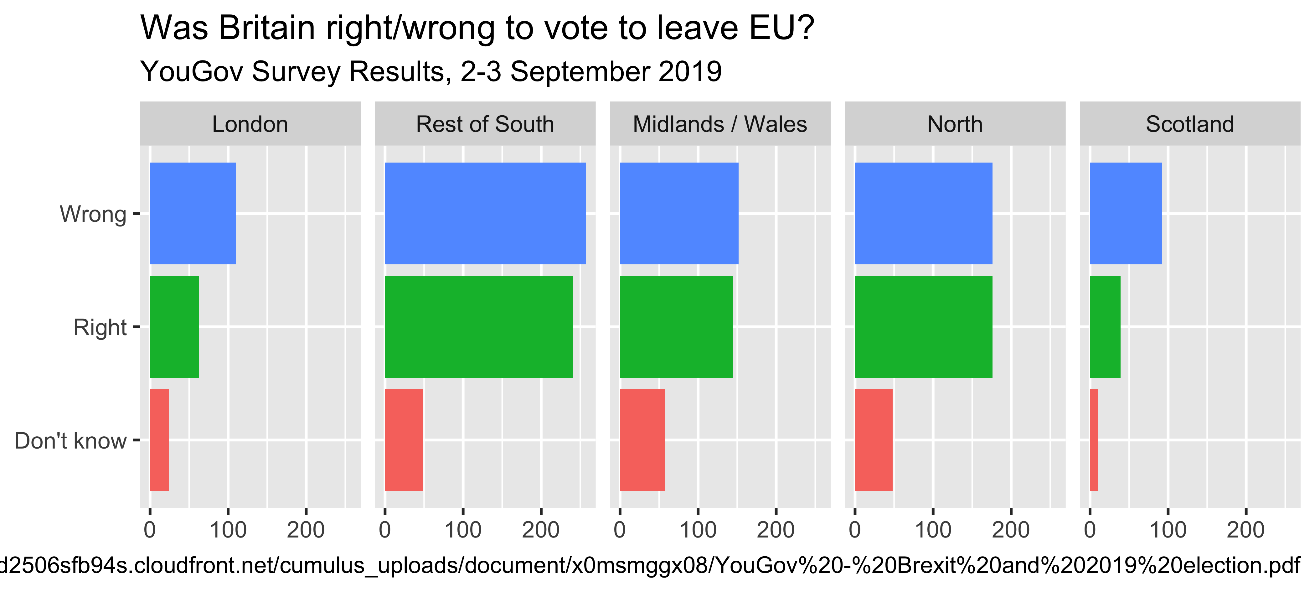
ggplot(brexit, aes(y = opinion, fill = opinion)) +
  geom_bar() +
  facet_wrap(~region, nrow = 1) +
guides(fill = "none") +
labs(
title = "Was Britain right/wrong to vote to leave EU?",
subtitle = "YouGov Survey Results, 2-3 September 2019",
caption = "Source: https://d25d2506sfb94s.cloudfront.net/cumulus_uploads/document/x0msmggx08/YouGov%20-%20Brexit%20and%202019%20election.pdf",
x = NULL, y = NULL
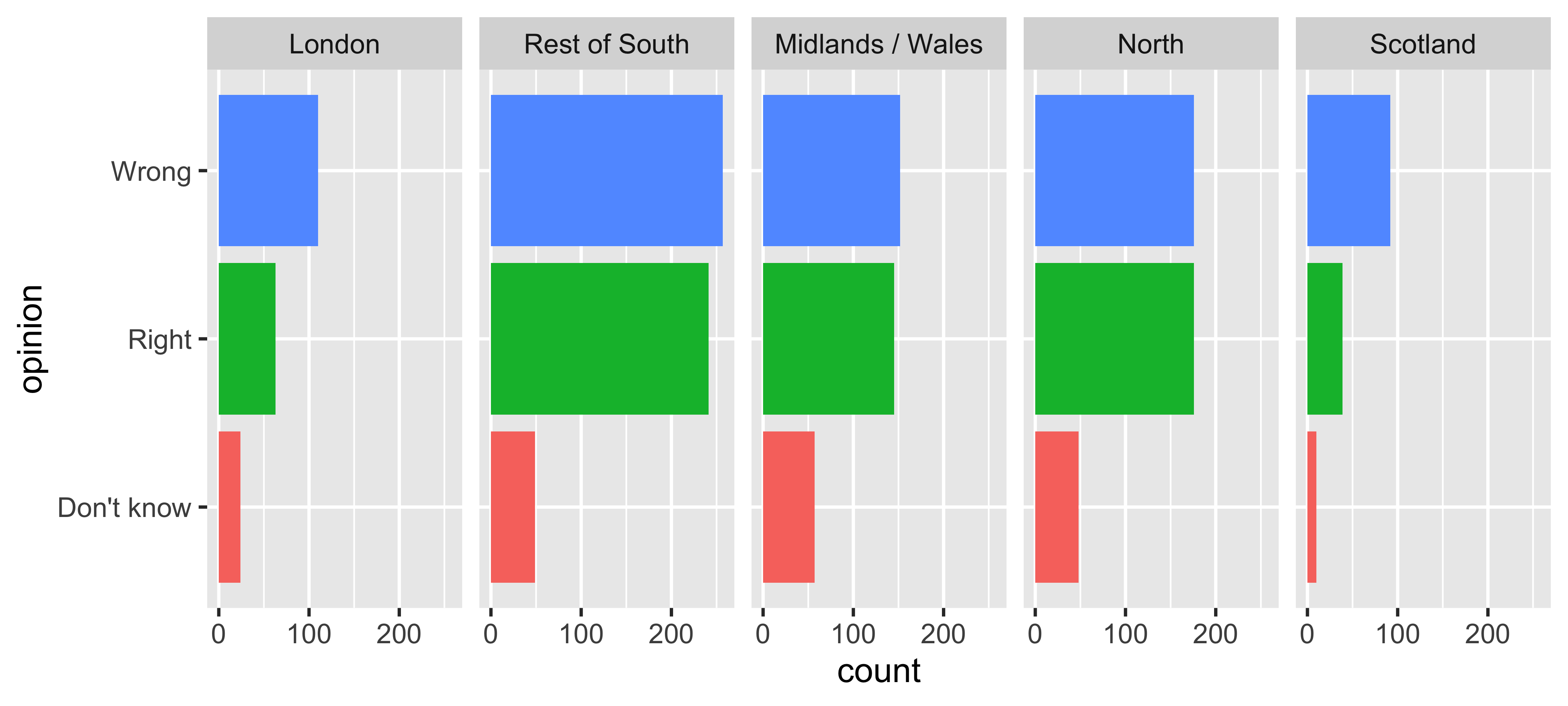
)Let’s do better
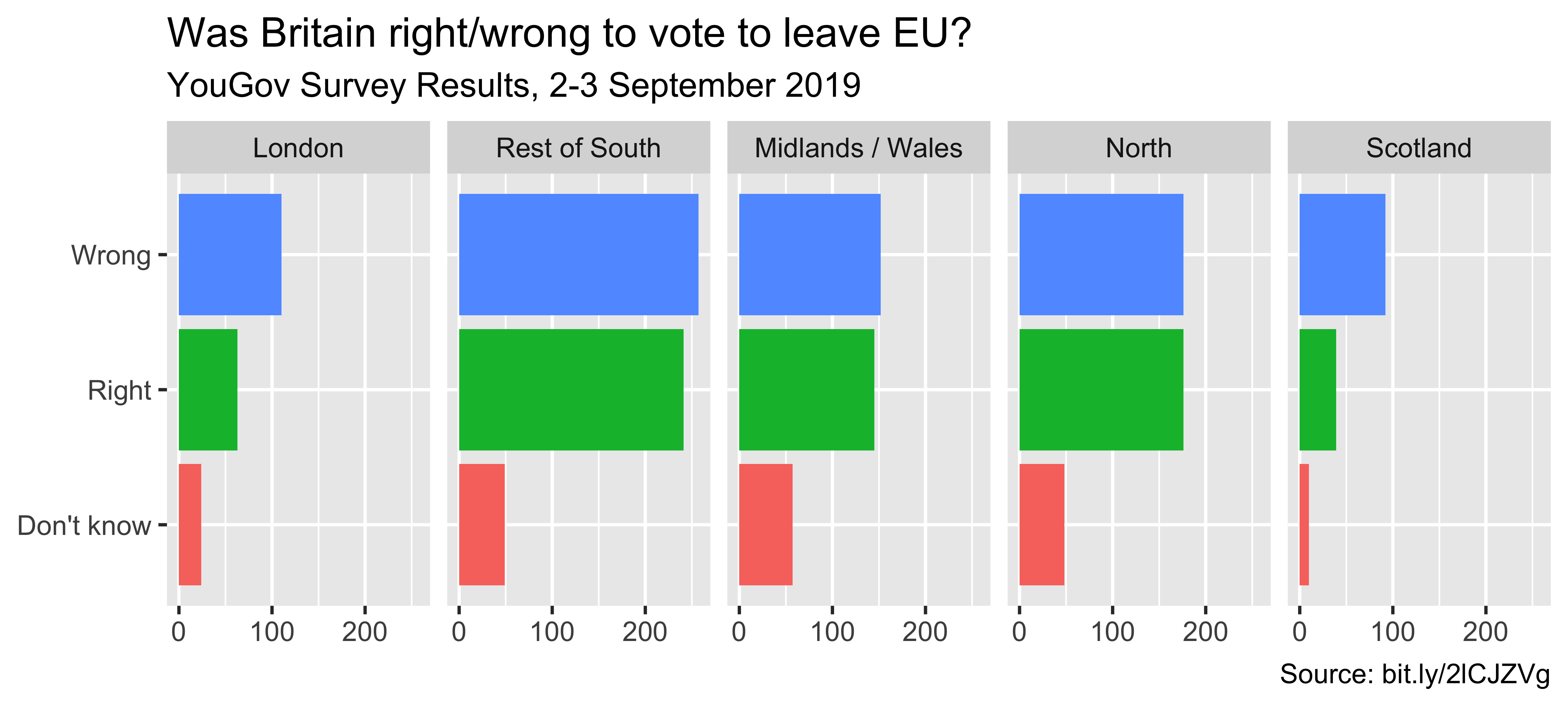
Fix up facet labels
ggplot(brexit, aes(y = opinion, fill = opinion)) +
geom_bar() +
facet_wrap(~region,
nrow = 1,
labeller = label_wrap_gen(width = 12)
) +
guides(fill = "none") +
labs(
title = "Was Britain right/wrong to vote to leave EU?",
subtitle = "YouGov Survey Results, 2-3 September 2019",
caption = "Source: bit.ly/2lCJZVg",
x = NULL, y = NULL
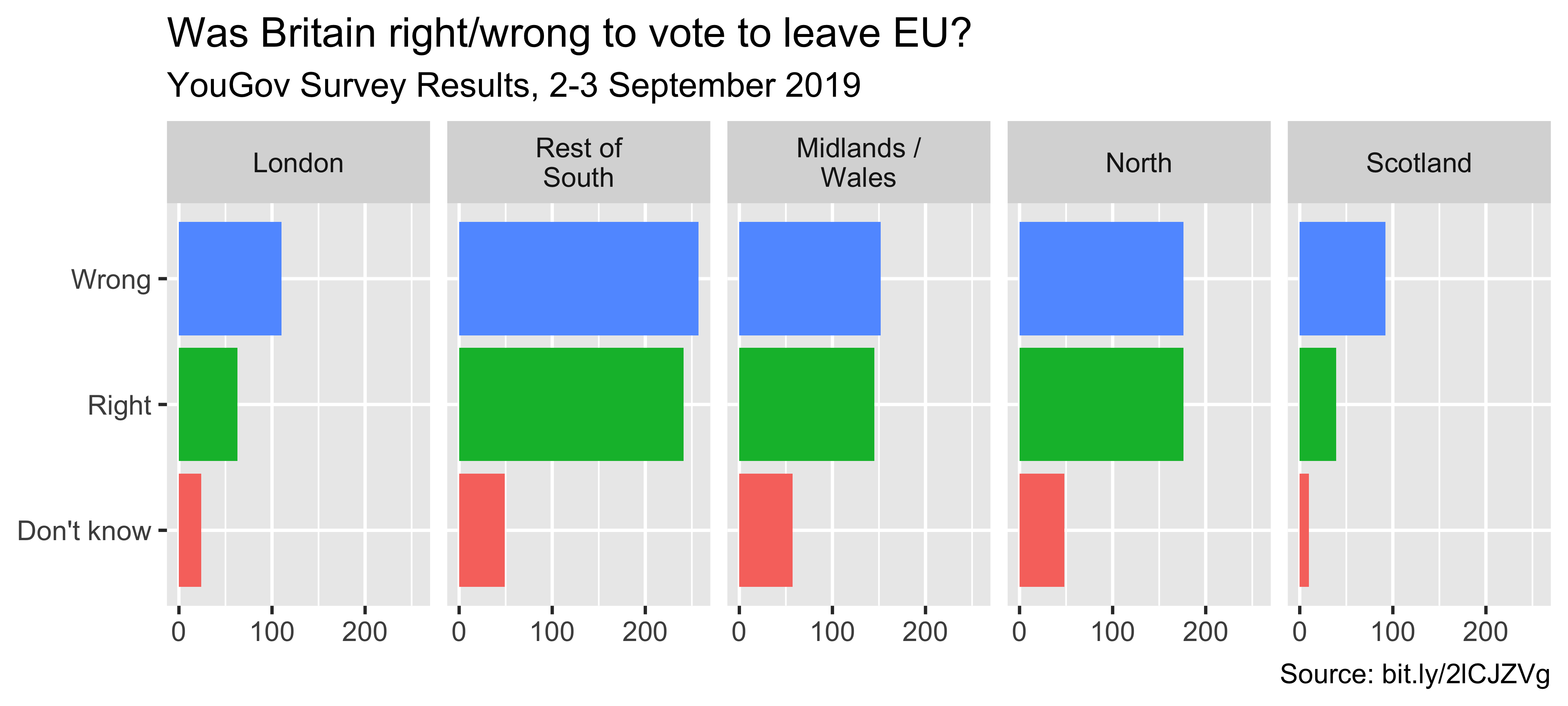
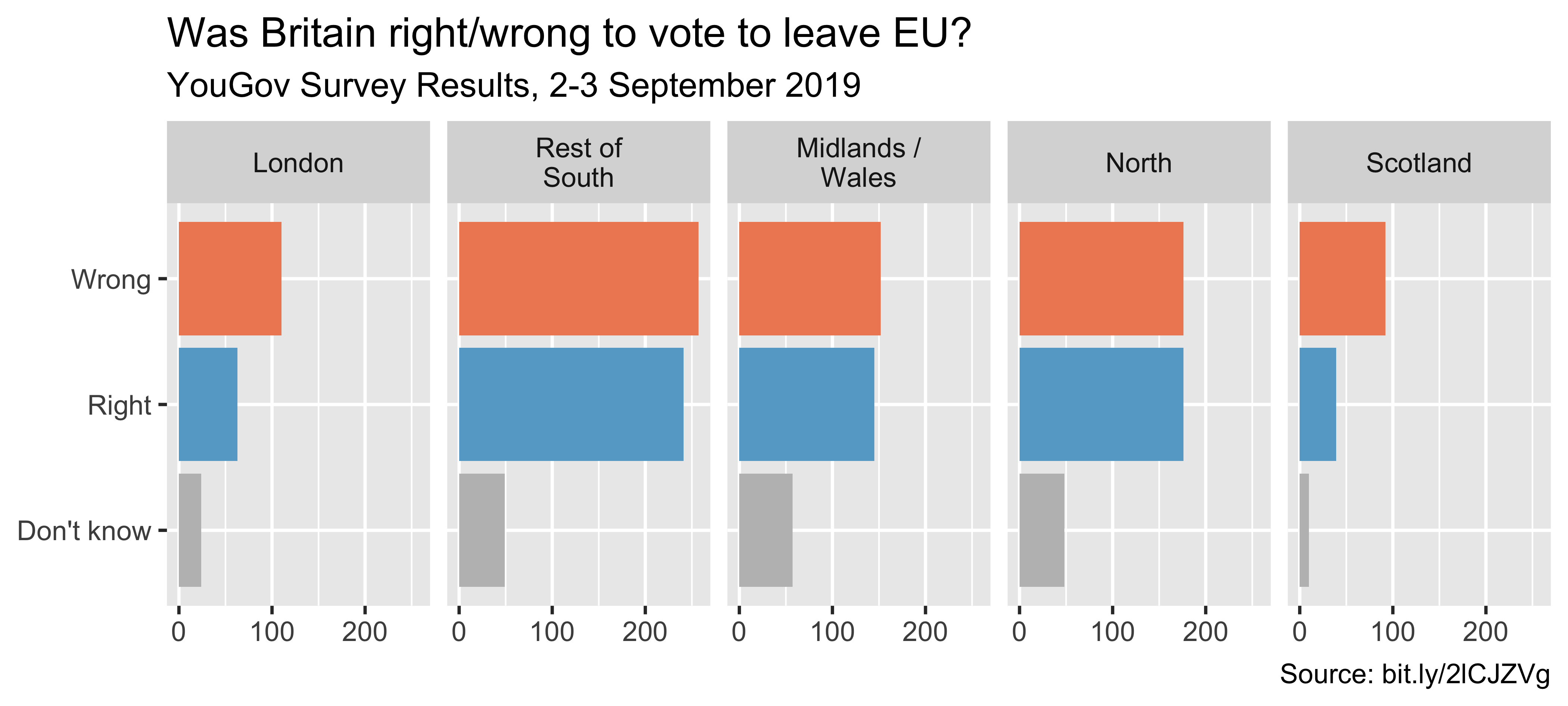
)Select meaningful colors
Rainbow colors not always best

Manually choose colors when needed
ggplot(brexit, aes(y = opinion, fill = opinion)) +
geom_bar() +
facet_wrap(~region, nrow = 1, labeller = label_wrap_gen(width = 12)) +
guides(fill = "none") +
labs(title = "Was Britain right/wrong to vote to leave EU?",
subtitle = "YouGov Survey Results, 2-3 September 2019",
caption = "Source: bit.ly/2lCJZVg",
x = NULL, y = NULL) +
scale_fill_manual(values = c(
"Wrong" = "red",
"Right" = "green",
"Don't know" = "gray"
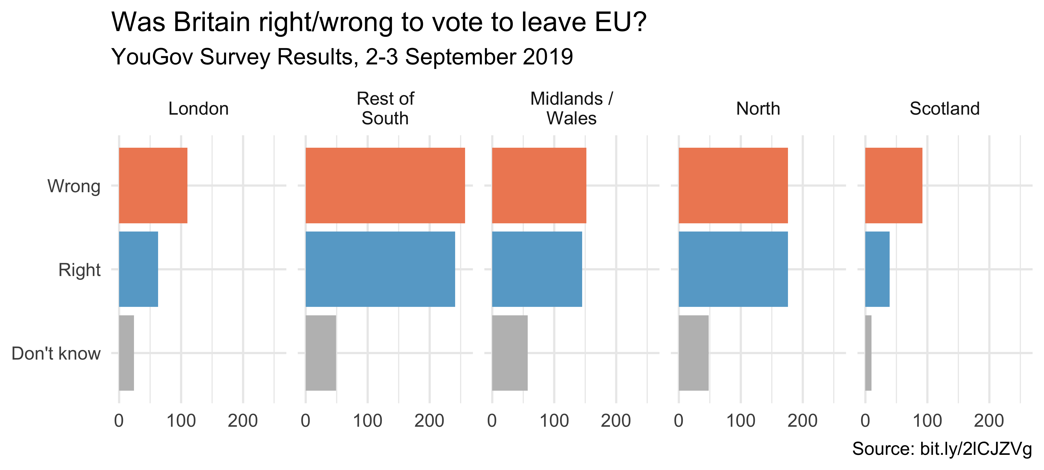
)) Choosing better colors
Use better colors
ggplot(brexit, aes(y = opinion, fill = opinion)) +
  geom_bar() +
  facet_wrap(~region, nrow = 1, labeller = label_wrap_gen(width = 12)) +
  guides(fill = "none") +
  labs(title = "Was Britain right/wrong to vote to leave EU?",
       subtitle = "YouGov Survey Results, 2-3 September 2019",
       caption = "Source: bit.ly/2lCJZVg",
       x = NULL, y = NULL) +
  scale_fill_manual(values = c(
    "Wrong" = "#ef8a62",
    "Right" = "#67a9cf",
    "Don't know" = "gray"
  ))
Select theme
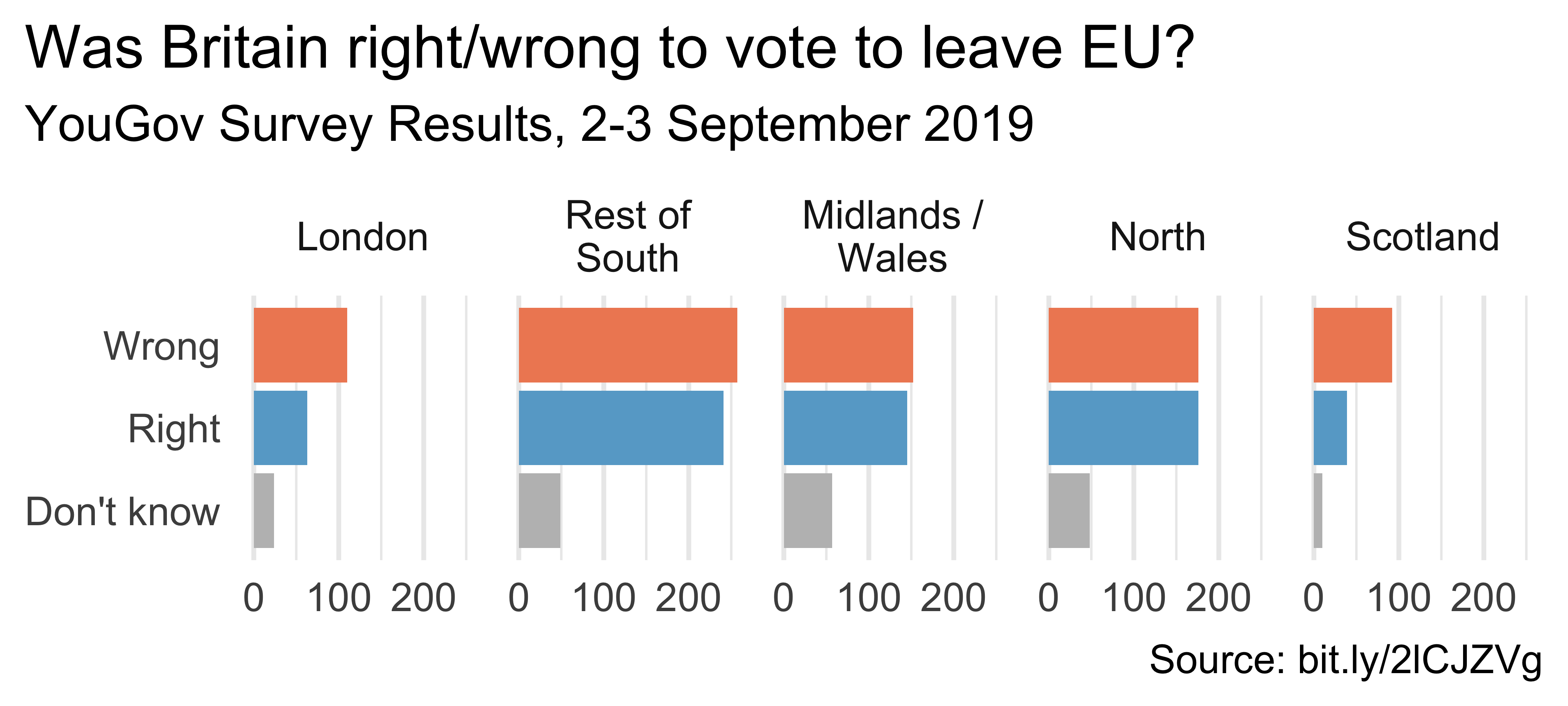
ggplot(brexit, aes(y = opinion, fill = opinion)) +
  geom_bar() +
  facet_wrap(~region, nrow = 1, labeller = label_wrap_gen(width = 12)) +
  guides(fill = "none") +
  labs(title = "Was Britain right/wrong to vote to leave EU?",
       subtitle = "YouGov Survey Results, 2-3 September 2019",
       caption = "Source: bit.ly/2lCJZVg",
       x = NULL, y = NULL) +
  scale_fill_manual(values = c("Wrong" = "#ef8a62",
                               "Right" = "#67a9cf",
                               "Don't know" = "gray")) +
  theme_minimal()
ggthemes described here
Customize theme
ggplot(brexit, aes(y = opinion, fill = opinion)) +
  geom_bar() +
  facet_wrap(~region, nrow = 1, labeller = label_wrap_gen(width = 12)) +
  guides(fill = "none") +
  labs(title = "Was Britain right/wrong to vote to leave EU?",
       subtitle = "YouGov Survey Results, 2-3 September 2019",
       caption = "Source: bit.ly/2lCJZVg",
       x = NULL, y = NULL) +
  scale_fill_manual(values = c("Wrong" = "#ef8a62",
                               "Right" = "#67a9cf",
                               "Don't know" = "gray")) +
  theme_minimal(base_size = 16) +
  theme(plot.title.position = "plot",
        panel.grid.major.y = element_blank())
Your Turn
- Read in the data (Data slide)
- Think of at least three different ways to tell slightly different stories with these data
- Try to implement at least one of these ideas!
Recap
- Can you determine what needs to be done to improve the effectiveness of your visualizations?
- Can you execute said improvements using
ggplot2? - Can you tell a story with data?